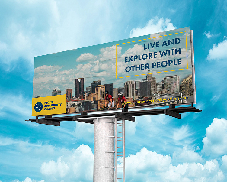
Peoria Community Cycling Concept
For this project I had to utilize the identity of an existing bike rental business in Peoria or create a new, conceptual brand. The goal was to think about how the bike rental’s identity will sell cycling, promote Peoria, use several various touchpoints, and incorporate sponsors in order to make it successful. I planned for Peoria Community Cycling to have a target audience of consumers ranging from ages 18-25 by showing the benefits of cycling and creating material centered around the Peoria community. I also aimed for my designs and material to be consistent while also updating the appearance of the bike rental business to reflect what it is today: a combination of in-person and digital interactions.
After choosing to go with a new, self-created brand, the process focused on research and narrowing down a brand identity. I started thinking about the themes, messages, and colors of the identity, then went forward with creating a logo. I wanted the final version to be recognizable and unique while also having some element of biking in its structure. This is why in the two "Cs" they're constructed to look like wheels and also stand for the initials of the brand.
The final solutions for this project came with the brand's expansion. The identity created gave Peoria Community Cycling its own look and the messaging told the audience directly that the brand surrounds community and having people connect with each other. Creating additional touchpoints also gave me a sense of creating different ways to add branding to material and how to expand a company's reach even further past social media and websites. At the end I was able to make an encompassing brand identity along with several promotional concepts that show how the company would connect with the Peoria community.


