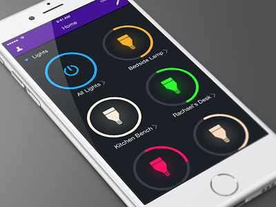
LIFX App Redesign
LIFX on the App Store
LIFX on Google Play
STORY TIME!
(Images and Video in the post below)
The LIFX app redesign has been one of my most controversial app designs of late. The original LIFX app had the same simple text list design for over 2 years, with minimal interface changes. Over the years however, the LIFX app itself had many feature additions, including custom Scenes and Schedules for your home automation, which were unfortunately buried within the old interface.
With any design that has stayed the same for a large period of time, you have to take care in bringing forth something new - even if the new concept aims to take all the most important elements and make them easier to access. Simply put: Some people hate change.
With that in mind, this redesign focused around one core ideal - "One Button Simplicity". If you play with the colors of your lights each day save a Scene so it's only one tap to turn it on each day. If you turn that scene on each day at a certain time, set a schedule so it does it for you. Automate waking up with your lights/coming home to a lit house and going to sleep at a time of your choosing, without needing to reach for your smart device.
In the past, before the smarts tab was added, you HAD to play with your lights each time to get it to what you wanted. Then we added scenes and schedules that actually saved you time - but we never educated people on why or how they could use them.
TL;DR:
Have a lot of lights? > Use groups.
Have a lot of groups? > Use scenes.
Have a lot of scenes? > Use schedules.
This redesign brings the Scenes, Schedules and Integrations to the main list, into helpful collapsible modules. The tap areas are now 'big buttons' [featuring a visual brightness percentage, color indicator and iconic LIFX bulb shape] - all wrapped up in an easy-on-the-eyes dark interface. Here is a quick video to show some of the comparisons from the old to the new: What's New in the LIFX app [VIDEO]
Overall, this new design has been received well. It has been quite humbling to have some of my assumptions validated.
Here are some more images of the interface:
Big Buttons
Color Wheel
Scenes
Whites Wheel
Themes
