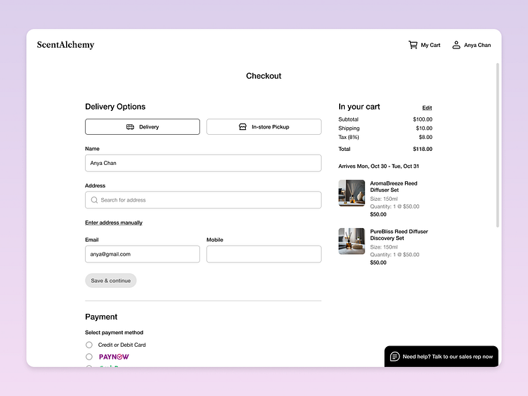
100 Days of UI - Checkout Page
⭐️ Day 02 ⭐️
My prompt:
Credit Card - Design a credit card checkout form or page. Don't forget the important elements such as the numbers, dates, security numbers, etc.
This design is inspired by Nike's checkout page.
Feel free to leave your feedback! ✨
Thanks for your support! 😄
--
Want to connect with me?
When the user scrolls down
More by Fiona Lim View profile
Like

