KINISI (THERAPY & SPORTS RECOVERY)
MY GAME PLAN
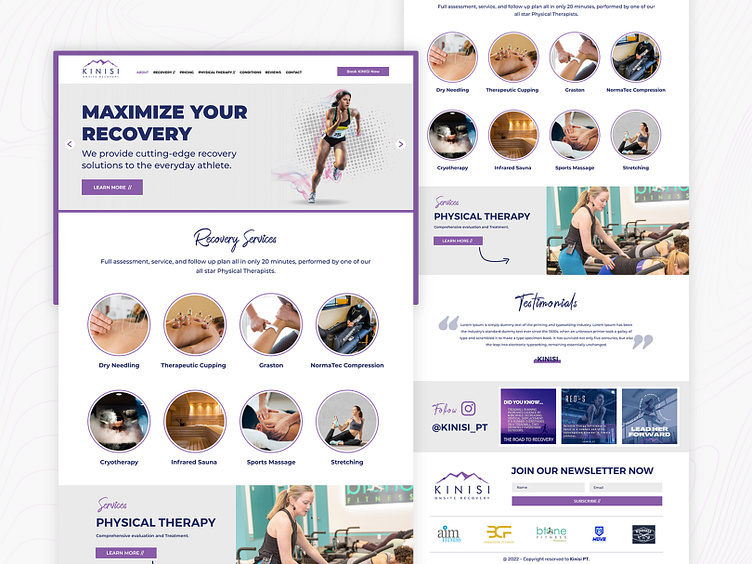
The Fluxers’ major objective was to create a site that users would feel secure spending time on and would be glad to share with their friends. The site was created to seem professional while yet being trendy. Everything is well put out for the user, and the navigation is basic enough that even first-time users will not get confused. The option to contact KINISI has been moved to the forefront of the website in an attempt to make it more user-friendly.
THE CHALLENGE
KINISI is committed to helping communities recover and thrive, which is why the organization sought to establish a fresh online persona. KINISI needed a unified website that presented its mission, primary services, and distinguishing characteristics in a unified manner. The primary focus was on creating a layout that was straightforward, simple to use, and visually appealing. For a greater digital impact, IDG was also given strong instructions to prioritize mobile optimization and established SEO practices. The facility’s guiding principles, such as its stated goals and objectives, should be prominently displayed. Finally, prominent “calls to action” that direct site users to do an intended task (such as making a purchase or signing up for a service) are essential.
THE RESULT
It won’t be hard for KINISI to aid recuperating and flourishing online communities given that they have so much manufacturing capacity. The site’s goals, services, and qualities are all shown in one place, and the design is both user-friendly and visually beautiful. Plus, we’ve included both mobile optimization and SEO. Calls to action are clearly displayed on the website. A perfect blend that showcases the vision of KINISI.

