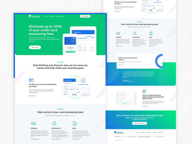
GoChyp (The Leader in Free Payment Processing)
My GAME PLAN
We started looking at various aspects of the brand’s reputation to determine which ones were legitimate and useful. The initial round of the makeover focused heavily on the website’s aesthetics. The second action was to learn more about cutting-edge technology that may help the business fulfill customer demands. An interactive form generator and a financial calculator were created as a direct outcome of this study. The completed forms help to organize customer contact information and simplify office management.
THE CHALLENGE
GOCHYP required a total revamp of their already existing website, their current website required new tools to follow up with the current clientele and a fresher look to attract new customers. The Fluxer had the challenge to revive the overall image of the brand with better user flow and proper portrayal of information. When it came to vitalizing the looks of the brand many options came into mind however the team needed to choose specific tools that could assist their brand in lead generation and gain a proper digital presence.
THE RESULTS
As a final product. The new and improved version of GOCHYP was established. This new website successfully highlighted all the information and key features. The current GOCHYP website has a modern and chic design with vibrant colors. The website is cohesive and has a smooth flow that is easy to understand and interactive. The system has two themes, dark and light. Their Financial calculator is the star of this revamp job.

