ESL_02
Need some more eyes here.
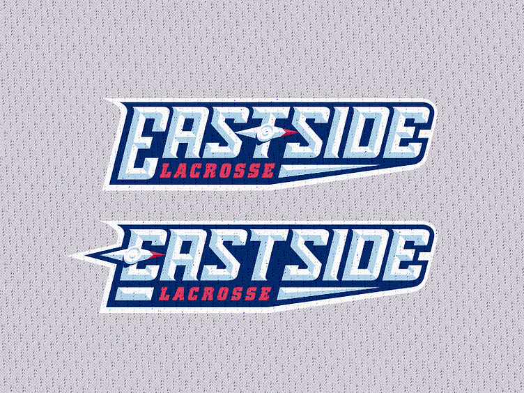
I'm working on some secondary wordmarks, and I want to get some opinions.
The bottom replaces the crossbar of the E in East with the compass needle pointing East — a logical placement of it. However, the STS combination has quite a bit of wonky air through it that, typographically, I really can't do much about.
In an effort to fill up that space, I tried putting the compass needle above the T as shown in the top version.
Aesthetically, I think the top looks better, and the larger Initial cap coincides with the full logo lockup. But the needle being atop the E in the bottom is more logical, so I really can't decide.