Webpage Redesign
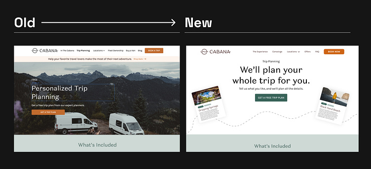
Sharing the "before" of the trip planning page. At first glance, I knew we could improve on this page in a lot of ways.
One of the things I wanted to focus on was clarity. I wanted the value prop to come across completely clear, so that in one second the user understands what our product does.
After this redesign, we saw an uptick in conversion for our trip planning requests! A great case of how investing in design directly creates more business.
More by Hasan Mangrio View profile
Like
