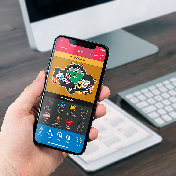
Peoria Playhouse Wayfinding App
These screens you see below were made as a conceptual user interface for the Peoria PlayHouse Children’s Museum in Peoria, Illinois. The goal of this project was to come up with a wayfinding app layout and system for attendees to navigate the museum, explore the exhibits, and use the app after leaving the venue.
The process of designing this app involved a lot of sketching and using what I learned in my UX classes to help make it useful. Having the benefit of working on UX/UI projects in the past with everything from websites to mobile apps gave me the advantage of thinking from the consumer's perspective and making something that's truly valuable for them. Ideas that I included in my sketches gave me a sense of what direction to go in and allowed me to refine the interface later on. As I created the actual interface designs using Adobe Illustrator, I wanted to include the museum's color scheme and add a sense of playfulness and organization with a mix between icons and text. I also wanted to use developments in UX, like the AR map view, to show an extended knowledge of upcoming technology and popular trends in that field.
I wanted this mobile app to have in-depth mapping, have features that entertain families, and include information that will help during a visit to the museum and after they leave. With this app, users are able to not only find their way around with the digital maps included, but also see directions in real time using augmented reality. There is also information about museum exhibits and even a variety of educational games that offer kids a chance to earn trophies both in the app and around the museum. I wanted the experience of using this app to feel like a complete package for parents and kids, giving them both what they're looking for and to add more depth to the content.


