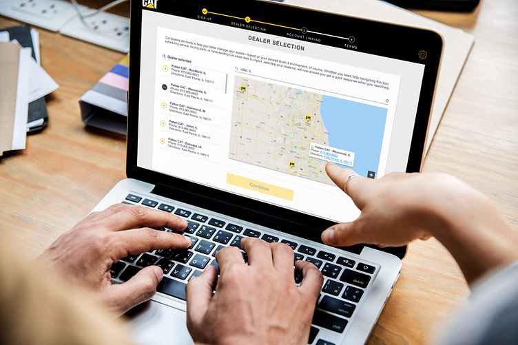
Caterpillar World Usability Day UI/UX Design Challenge - Desktop
Early stages of the project involved our group creating user and business goals surrounding the dashboard redesign and improving it for easy access, equipment management, and secure online support. We analyzed the current design of Caterpillar's dashboard as well for any issues, areas of improvement, or aspects that work best.
After this initial phase we started to focus on user research, persona creation, and user flows. Our team created an example persona of someone who would use our product as a Caterpillar employee. From there we made a user flow diagram that was a storyboard for how people would interact with our program, how they would feel at certain points, and what their positives and negatives were about their experience. This helped us refine our sketches and plans for the prototype during building.
The final stages of this project involved prototyping the dashboard, testing it with users, refining it at Caterpillar, and presenting to our class and Caterpillar's UX team. We wanted to streamline the dashboard with color coding for the status of assets, add icons and pictures to break up elements, and to create a consistent appearance. Our team wanted the experience to feel familiar yet fresh when someone would be using the program. We also aimed to have our version track the progress of users at certain points so they knew whether they were logged into the system or the equipment was working fine. Going to Caterpillar also gave us direct experience with UX professionals who helped us strengthen our design to be even more efficient.


