Token Base Design System Guidelines
I aimed to create a system that offers variability, eliminating the need to assemble each style component separately and making it as easy as adding Light Mode and Dark Mode palettes to the site. Various styles were set aside, resulting in the following:
Challenge:
A unique design system that adapts to the colors, styles, and requirements of up to 40 sub-company brands.
Work Done:
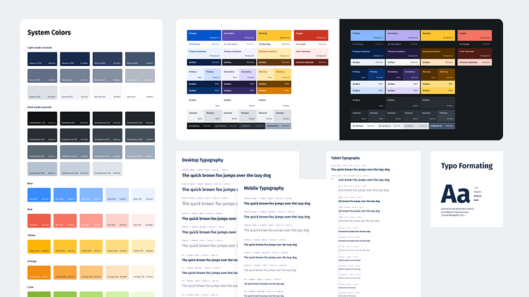
Colors: We have one primary collection of colors, including Dark/Light Neutrals, Primary, Secondary, Danger, Warning, Success, and more. We also have Brand Tokens. These Brand Tokens are linked to the Primary and Secondary colors of the main collection, and switching brands changes the colors throughout the site.
Sizing: I've curated a collection of sizes and Spacing Tokens, along with Radius Tokens that come in various variations.
Spacing Tokens: Desktop, Tablet, Mobile
Radius Tokens: Angular, Rounded, Super Rounded
Additionally, we have Radius-dependent paddings that function as follows:
If BorderRadius = X, Padding = Y.
The colors, shapes, and sizes of the entire design rely on these tokens, which are later exported in SASS, CSS, Tailwind, Stylus, Javascript, or Json format and integrated into the code. This enables you to set up a single style component and easily change styles using tokens."


