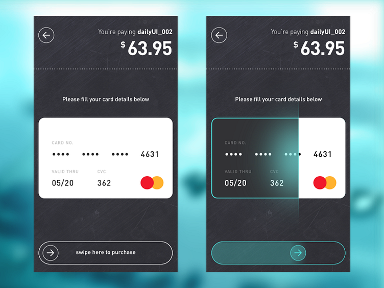
Credit Card Checkout - #dailyui #002
Since other folks have done a great job translating the analog look of a credit card to mobile UI, I'm taking a stab at translating the analog experience of using a credit card, which is swiping.
That being said, swiping a card would be awkward due to its width versus the phone width. Therefore, I opted to do a scan when user swipes instead.
Let me know what you guys think!
Don't forget press L and to see it @2x!
More by Khai View profile
Like
