Chat Apllications
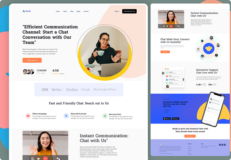
Creating a landing page for a chat application involves careful planning and design to attract potential users, convey the application's value, and encourage conversions (e.g., sign-ups or downloads). Below is a case study for designing a chat application landing page.
Case Study: Chat Application Landing Page Design
Objective: Create an engaging and informative landing page for a chat application to increase user sign-ups and downloads.
1. Target Audience Analysis:
- Identify the primary target audience: Are you targeting consumers, businesses, or a specific niche?
- Understand user demographics, needs, and pain points to tailor the messaging and design accordingly.
2. Define Key Features and Unique Selling Points (USPs):
- Highlight what sets your chat application apart, such as encryption, ease of use, collaboration features, or platform compatibility.
3. Design and Layout:
- Keep the design clean, simple, and visually appealing.
- Use high-quality images and icons that represent the application's user interface.
- Create a responsive design for mobile and desktop users.
- Use a clear and compelling headline and subheadline to explain the app's purpose.
- Include a prominent call-to-action (CTA) button for users to sign up or download the app.
4. Messaging and Content:
- Use concise, persuasive copy that explains the app's benefits and value.
- Incorporate user testimonials or success stories to build trust.
- Create engaging videos or animations demonstrating the app's features.
- Use bullet points to list key features and benefits.
- Showcase any awards, recognitions, or user numbers if they are impressive.
5. Trust and Security:
- Assure users about data privacy and security if the application uses encryption or has other protective measures.
- Display trust badges, affiliations, or certifications to build credibility.
6. Clear CTA:
- Place a clear and compelling CTA button (e.g., "Sign Up," "Download Now") above the fold.
- Make the CTA stand out with a distinctive color.
- Use persuasive language that implies a benefit, such as "Start Messaging for Free."
7. User-Friendly Navigation:
- Include an easy-to-navigate menu or scroll-to sections.
- Use anchor links for one-page scrolling if necessary.
- Keep the navigation simple and intuitive.
8. User Onboarding:
- Consider including a guided tour or tutorial to show users how to get started.
- Provide an option for users to start a trial or demo.
9. Responsive Design and Testing:
- Ensure the landing page is mobile-friendly and loads quickly.
- Test the landing page on various devices and browsers to ensure compatibility.
10. Performance Metrics and Analytics:
- Integrate analytics tools like Google Analytics to track user engagement, conversion rates, and page performance.
11. A/B Testing:
- Continuously optimize the landing page by conducting A/B tests on elements like CTA buttons, copy, images, and layout.
12. Feedback and Iteration:
- Gather user feedback through surveys, usability testing, and heatmaps.
- Regularly iterate on the landing page based on user feedback and performance data.
13. Marketing and Promotion:
- Promote the landing page through various marketing channels, such as social media, email campaigns, and paid advertising.
By following these steps and continually refining the landing page based on user feedback and performance data, you can create an effective and engaging landing page for your chat application, driving more sign-ups and downloads.

