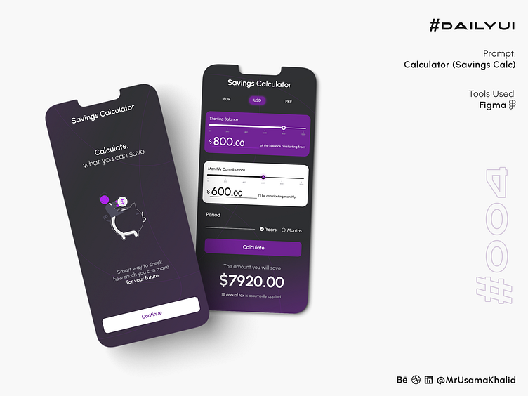
Savings Calculator #DailyUI
#DailyUI
Challenge #004
Prompt: Calculator (Savings Calc)
Tools Used: Figma
Components
Header: The header contains the app's name, Savings Calculator, and three currency symbols: EUR, USD, and PKR. This allows users to quickly select the currency they want to use for their calculations.
Input fields: The input fields allow users to enter their starting balance and monthly contributions. The fields are clearly labeled and have a placeholder text to provide guidance to users.
Button: The button labeled "Calculate" triggers the savings calculation. The button is large and prominent, making it easy for users to find and tap.
Output field: The output field displays the calculated savings amount. The field is also clearly labeled and has a large font size, making it easy for users to read the results.
Design theory:
The UI of the Savings Calculator App is based on the following design principles:
Clarity: The UI is simple and easy to understand. All the components are clearly labeled and have a specific purpose.
Consistency: The UI uses a consistent design style throughout. This makes the app look more polished and professional.
Efficiency: The UI is designed to be as efficient as possible. Users can easily enter their information and get their results without having to navigate through complex menus or screens.
Accessibility: The UI is designed to be accessible to a wide range of users, including those with disabilities. The font size is large enough to be easily read, and the buttons are large enough to be easily tapped.
Summary
The UI of the Savings Calculator App is simple, clear, consistent, efficient, and accessible. It is well-designed and easy to use.
Use of negative space: The UI uses whitespace effectively to create a sense of balance and organization. The components are not too close together, and there is enough space around each component to make it easy to read and tap.
Color palette: The UI uses a limited color palette of white, blue, and green. This creates a clean and modern look for the app.
Typography: The UI uses a simple and easy-to-read typography. The font size is large enough to be easily read, and the font style is clear and modern.
Iconography: The UI uses a few simple icons to indicate the function of each component. For example, the "Calculate" button uses a calculator icon, and the output field uses a money bag icon. These icons help to make the UI more visually appealing and easier to use.
Overall, the UI of the Savings Calculator App is well-designed and easy to use. It is clear, consistent, efficient, and accessible. The use of negative space, color palette, and typography is effective in creating a visually appealing and user-friendly interface.
Let's connect ✦✦✦
Let me know your thoughts in the comments.
I always love to receive feedback on my work!
Please share to help me promote my work!


