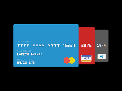
Daily UI 002 - Credit Card Checkout
Two ideas I was exploring with this design:
1. Keeping it familiar
Using a physical credit card's shape and typography to make the digital equivalent instantly recognizable.
2. Help the user pick out the right card
Which card should the user use pick? It depends mostly on information we are unlikely to have such as spending limits, current balance, best discounts for type of purchase, etc. So we're not much help in that regard and the user will have to spend a few brain cycles and figure out which card makes the most sense financially.
From our end, let's just keep the identification and selection process as simple as possible. The design reveals one default card on top and exposes the minimum information the user should need to identify the other cards:
- Color
- Type
- Last four digits
