Forestea | Brand Identity
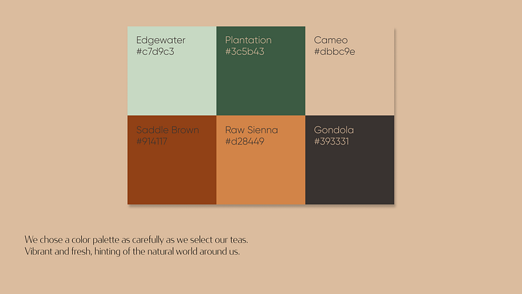
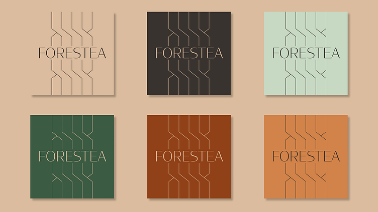
The Colors
I started with the color palette, which got me thinking about autumn and the forest. This is my favorite time of year, and the colors are warm and inviting.
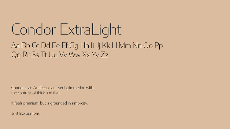
Typography
Originally, I was planning to design my own geometric-inspired font to fit this brand's vibe, but I fell in love with Condor immediately. It's clean and elegant, but capable of making a strong impression that expresses the brand identity perfectly.
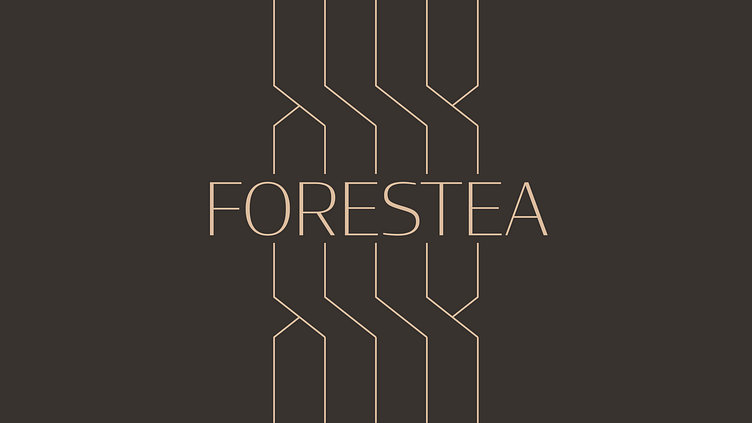
The Logo
I designed the logo with the idea of potential packaging in mind, creating clean, geometric lines that are simple to translate to the variety of shapes and sizes tea would be packaged in. Simplicity, with an elegant vibe.
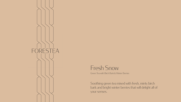
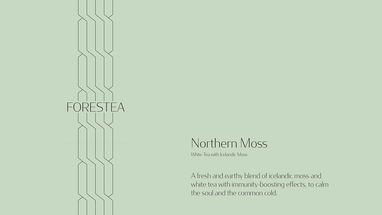
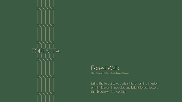
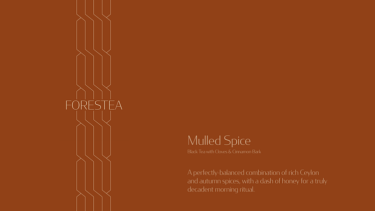
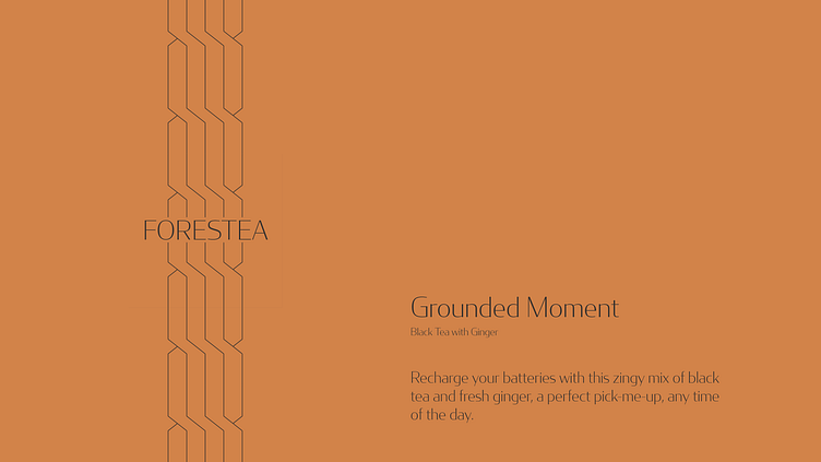
Flavors and Brand Voice/Tone
The flavors I chose were the result of considering the different seasons and moods of the forest, and how those could be brought to mind by combining unique ingredients. I stopped at 6 flavors, which felt like a good amount of variety while still maintaining a small-batch-manufacturer vibe.
The descriptions are brief and the tone is casual, but they create a mood that embodies this brand's love for their tea and belief in their product.

Website and full case study launching soon!
Now, I'm working on the UI/UX design of a website for this portfolio project, which will be launching soon! Keep an eye out of social media for that launch, @smorejon.design
Thank you!
For more samples of my work, visit my website: smorejon.com
