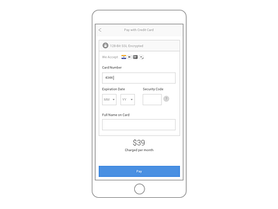
Day 2 - Credit Card Checkout
Pretty simple one today. I know the tendency is to make it look like a credit card and then the user fills it in. But I find that those are often slower than just simple form layouts.
The credit card icon will light up depending on the prefix being entered into the credit card field.
Nothing too earth shattering. Just clean and simple.
More by Dennis Eusebio View profile
Like

