Scuup
About
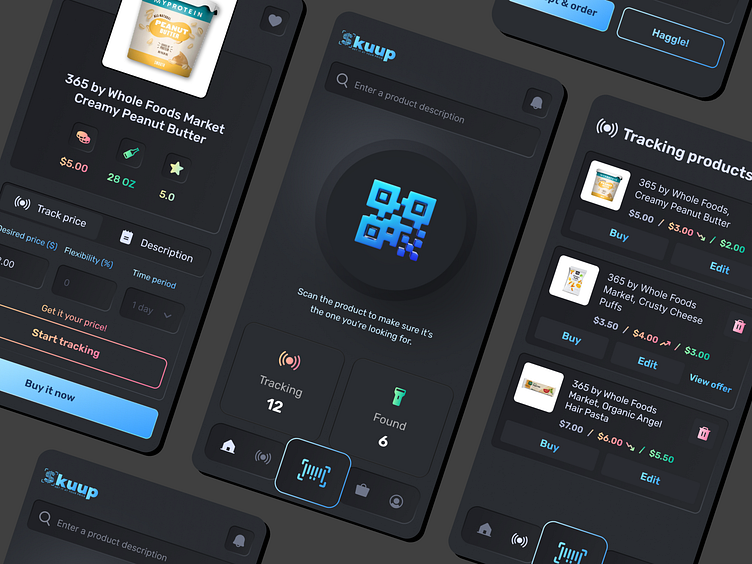
The job was to redesign a mobile app where you can set and negotiate your own price on grocery food items. "Interesting!" we thought. Is it even possible to set your price on non-expired foods? Apparently it is. So we went to work...
Our Solution
Everyone loves a good old flat design. After all, it has been the dominating UI layout style for nearly the past 5-7 years. It is safe, versatile, and easy for getting a buy in. So we started with your basic light and pastel-ish approach. Turns out it ended up looking too similar to the old design & was rather boring. So we decided to shift to a dark mode, increasing color intensity, adding slight gradients, while maintaining an overall flat look. Better! But still plain & not enough to express the app's purpose.
We decided to shift to neumorphism. One of the limitations of neumorphism is that its slight color differences between foreground and background can make it hard to distinguish elements from one another. So we decided to introduce brighter colors and gradients to offset that while keeping the overall minimalism.
This was the right move, and taken to the entire UI brought elegance and appeal to an app that has a fairly basic purpose. When in doubt about how to make something stand out, think different. Pull something out that's uncommon and inject it with life!
Services we provided
UX/UI design
Visual design
Mobile App Design


