Album Art - MBBB - "I: GERMINATION"

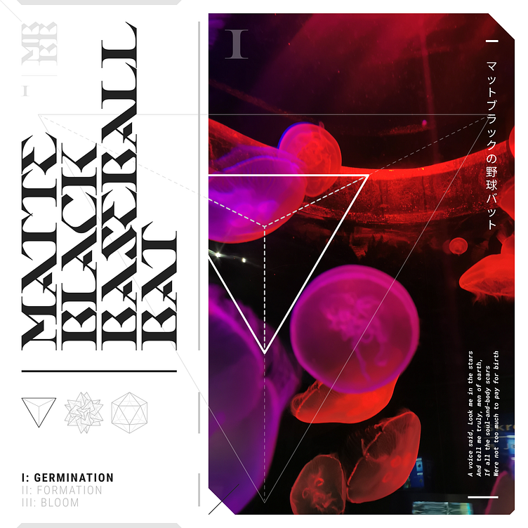
I've been busy with album art designs for my recording project, MATTE BLACK BASEBALL BAT (coming soon), and this is the first final mockup of the first album, "I: GERMINATION".
In graphic design school, we were taught to never set type vertically or by any orientation other than the horizontal standard, though if we absolutely had to, vertically from the bottom up would be acceptable. However, something else we were taught is that, "once you know the rules, you will know how to break them".
Personally, I am of the opinion that type itself can be used as a graphic element and that it can be set however the designer sees fit. Naturally, discretion is advised. If important information needs to be communicated, legibility and logic will steer the design, though a designer may choose to integrate such information into the graphic composition of the piece to such a degree in order to make a point or be conceptual that it doesn't matter. It depends on what the intent is.
With this piece (and the ones to follow), I've opted for a kind of blend of the logical and abstract, though sparingly so as my tendency for a clean look will usually triumph over abstraction. 😂I used my own photos for these designs and am so happy that my abstract photography is finally being put to good use as I've built up quite a catalogue over the years to draw from!
Enjoy and let me know what you think.
Detail: