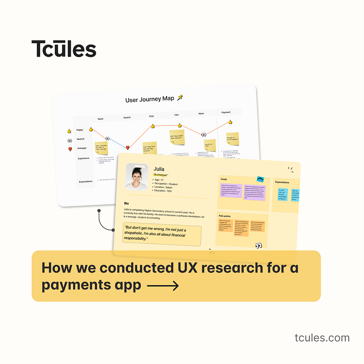
How we conducted UX research for a payments app
A FinTech company approached us to conduct user research and validate their innovative concept. The goal was to help the client identify their users, understand their behavior, and the problems they face while using similar apps. We executed this UX research in four phases:Stakeholder interviewsCompetitor analysis as a secondary researchQualitative user research as a primary researchUX strategy
Establishing the objectives
We had 4 clear objectives for our UX research:
Identify the target audience, understand their behavior and their current processes pertaining to payments apps
Find their key pain points vis-à-vis payments apps
Understand what motivates them to use a payment service
Identify and understand the competitors in the space
User research methodology
Stakeholder interview
As a fintech design agency with a systematic approach to design, we performed both, primary and secondary research. But, before proceeding further with UX research, we interviewed the stakeholders. It was important to understand how they perceived their product, target audience, and the problems they hoped their app would solve for its users.
Primary research - User Interviews
As part of our primary research, we conducted 20 user interviews, similar to persons we created. The purpose was to have a qualitative perspective of the experiences of actual users who used payments apps in their day to day activities. It helped us to understand exactly what users look for when they use a payments app, their primary pain points and what we can do to make their experiences better.
Secondary research - Competitor Analysis
It was not possible to reach out to every single user of competitor apps and so we took to social media and app stores. We analyzed reviews and interactions from social media platforms like Twitter, Facebook etc. to gauge the general consensus of people towards payments apps, what led them to form their opinion and what could be done to change an unfavorable one.
Empathy Mapping
Empathy mapping was used to help us synthesize our observations from the research phase. It enabled us to draw out unexpected insights into the user’s needs. Understanding the users’ mentality, helped us to identify genuine issues, problems or concerns that the users may have.
Creating user personas
The next important step was to create user personas. We focused on creating goal-directed user personas that would help us identify design problems and devise product strategy. It provided a clear understanding of the user behavior and who the product was being created for.
Observations from the research - concept validation
One salient feature of the UX research was helping put things in perspective. It helped the client to understand the needs of their ideal target audience and if they were in line with what they had perceived. It’s not an irregular occurrence when a product is overloaded with unnecessary features which are not appealing to the users and end up being an annoyance.
Final Outcome
A better understanding of their user base, their needs, their complaints.Brought more clarity to the product and marketing strategy.Finally, with the help of design mockups, the client was able to understand what their app would look and function like.
Checkout more case studies here.


