Peddlr Homepage Redesign
This was a part of my technical examination for my job application as a UI/UX Designer at Peddlr
The task was to redesign the Home tab of the Peddlr mobile application to provide a more usable and accessible user experience.
I have presented 3 options:
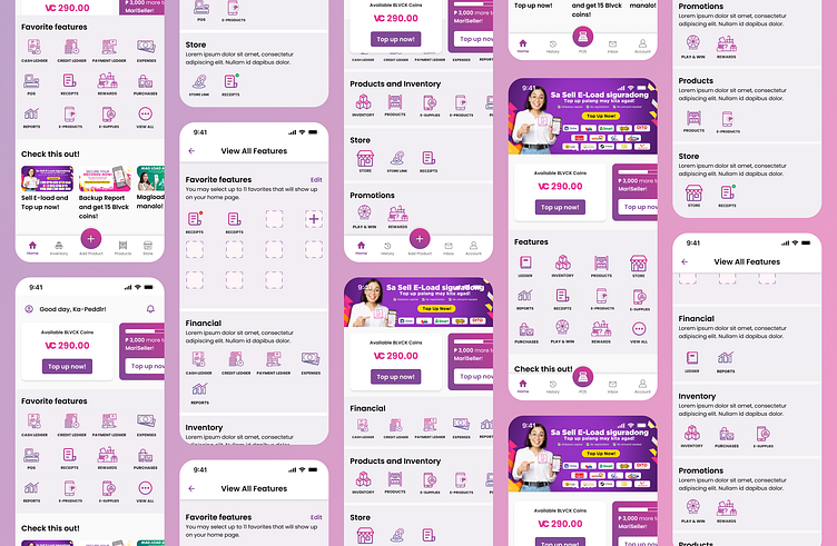
The first option is the first two screens from the left. There were no significant changes except for the navbar, the BLVCK coins component, the MariSeller component, and the reduced feature icons from 16 to 12. I have also added a View All icon so that users can see the other features/functionality the applications have. On the View All features page, the user is able to select which features are going to be displayed on the homepage so that they are able to prioritize the features that they are frequently using.
The second option is the middle screen. On this option, I have incorporated a significant change already which is found on the navbar. I placed the common functions that the user might be using from time to time and added a History feature so that users are able to view their transactions on the application. All of the features are already displayed on the homepage and are categorized according to their common features.
The third option is the last two screens on the right. This option is a combination of the first and second screens with the navbar having the biggest change as I opted for the POS functionality to be the main button instead of the Add Product function.
The reason why I have presented three options instead of sticking to just 1 is to ensure that the stakeholders and product owners have other options. Having several options is important so that they can also suggest an improvement, consider other scenarios that haven't been considered by the designer, and most of all, comment on if the changes presented would require a significant learning curve. However, if I am going to choose just one out of the three, I would pick Option 1 first and then slowly transition to Option 3 so that users won't be frustrated with the sudden redesign.
I have also presented other suggestions such as creating a user onboarding tutorial especially if there are new features or changes that have been released, merging functions on the same page since I'm certain that some functions could be grouped into one instead, and lastly is to give users the ability to change the language used as some users are more comfortable using English as their default language application.
Unfortunately, I wasn't lucky enough to make the cut as they moved forward with another candidate whose qualifications more closely align with their current needs.
