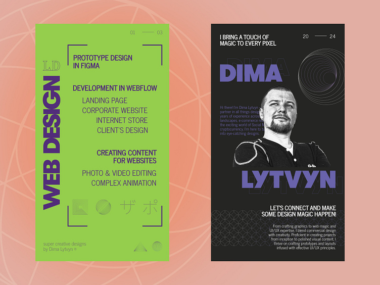
My services mockups for Instagram highlights
🥑 When every pixel matters…
This story begins with the decision to renew the design of the highlights with the My Services descriptions on Instagram. At this time I wanted to create a blend of the typography layouts with high-contrasted color palettes and geometric shapes. The inspiration came from the works and approaches of Max Shirko, a talented Ukrainian web designer 💛💙
Images, images, typography, typography, clicks, clicks. I explored tons of images to find some ideas for the design compositions and interesting fonts.
I felt big drops of sweat on my forehead when I started to design mockups 😅 It was really challenging to build a different composition grid for each asset and create diverse text layouts. Time after time I checked each pixel of distance for text block and graphic elements 📐 Two or three pixels of difference made the whole design crooked and inaccurate.
🥑 After 4 days of work I got 6 typography-based mockups. All elements took their designated places and the design looks minimalistic and clean 👌 Another brick of experience in the wall of my professional career.
Do you like it?
📲 Ready to design creatives like these for your business? Then drop me a couple of sentences to direct messages and we start!
⬇️ Stay tuned and subscribe ⬇️
📧 lytvyndmytro89@gmail.com


