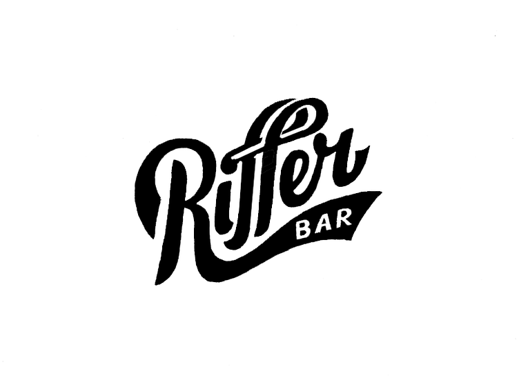
Riffer Bar 2
I really liked the logo by Kakha Kakhadzen, but I thought the second "f" needed a bit more accentuation, here's my stab at that. Otherwise, nothing is changed save for some photoshop paint bucket work.
More by koos kleven View profile
Like
