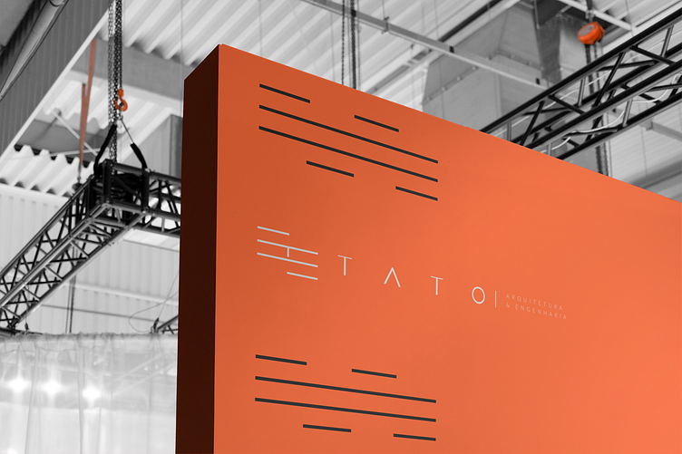
TATO Architecture & Engineering - Brand Identity
TATO Architecture & Engineering is an office that provides project development services in the construction and design fields, as well as construction and execution services. The name TATO is a combination of the surnames of the partners, Daniel Tanahashi and João Tonet. In addition, the brand name has a meaning that represents the intrinsic link between "touch" and "architecture", where touch plays an essential role in how we experience and interact with built spaces.
The brand symbol was inspired by the facades of modern buildings, with straight lines that evoke marquees and architectural facades. The internal space of the symbol suggests bricks and engineering structures, establishing a visual connection with the company's work. The colors were chosen to combine sober and sophisticated tones. Orange refers to the texture of brick and provides an attractive contrast, while gray tones in graphite evoke concrete and white suggests the idea of finish. The brand's typography was custom-designed, taking into account the short name and its geometric shapes. The supporting typography follows a style of thin, straight lines with adjustments to align it perfectly with the brand name.
