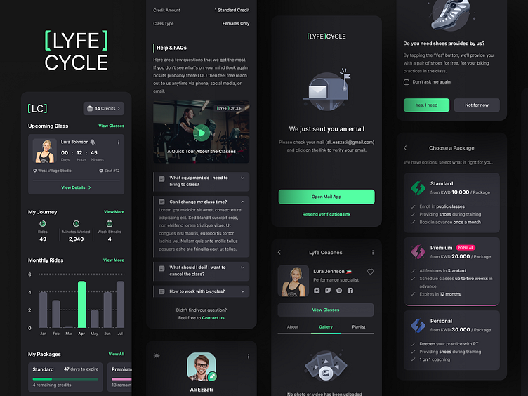
Lyfe Cycle - Cycling Classes App
📝 Quick Intro
Lyfe Cycle is a boutique spinning studio that prides itself in its trendy and freestyle approach to clients, with hip music and fun jams. Lyfe Cycle empowers its people to create positive change through an outstanding environment for indoor cycling and spinning workout classes.
📝 Wireframing
Designing wireframes helped us align on requirements, keeping UX design conversations focused and constructive. The aim was to communicate the structure of possible solutions so we could identify solid user experience (UX) design foundations to build on and stakeholders could offer feedback on a visual item.
🌗 Light and Dark Themes
We started working on Light Mode first but realized that dark mode can be a user’s preferred choice for several reasons. In more extreme situations, when someone is experiencing a visual impairment, dark mode allows them to recognize and read information more easily. These reasons, coupled with the fact that light mode can elevate risks for eye disease, gave us enough cause to design for both modes and allowed users to toggle between the two when necessary. So by including both light and dark modes in our design, we tried to give our users the power to decide what is best for their individual experience.
🖥 Desktop Version
We designed the platform using mobile-first principles in order to make the user experience seamless across all breakpoints. So one of our latest steps in User Interface design was converting mobile-sized frames into well-formed desktop frames.
📐 Style Guide
During the design phase, style guides encourage consistency. That's why I tried to constantly update the style guide step by step during our visual experiments to better communicate the UI identity to our team and our client.


