App Rolex ⌚️
Hello friends! 🙌
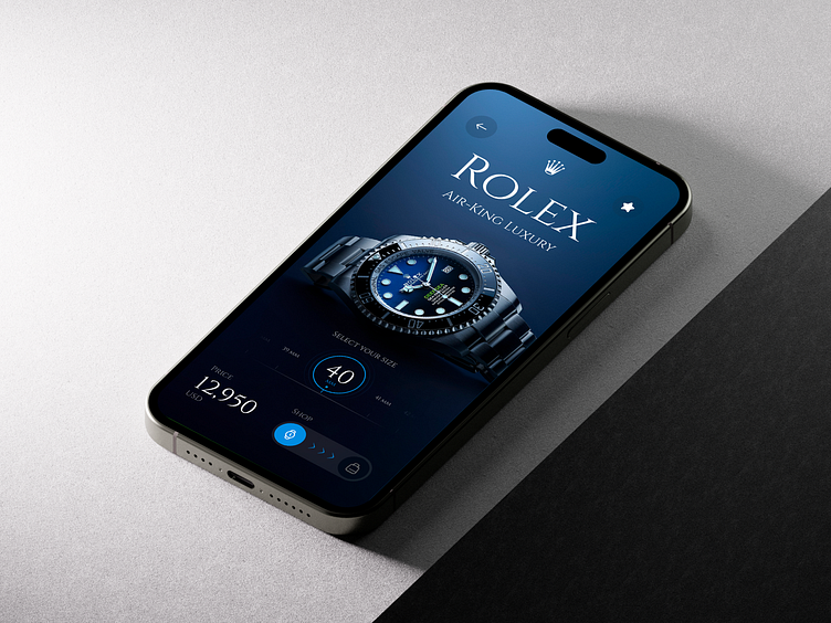
I present to you a user interface concept for a Rolex mobile store 🤳
This application allows you to find and buy the watch in your style ⌚️,
Let me know your opinion in the comments! Thank you!
Colors
For this proposal, Mobile uses blue tonal colors so that it can contrast well with the content of the interface (images, text, icons and buttons. I used blue tones to represent the security of a purchase in the application ⌚️.
I have used a serif font so that it can represent the elegance about the products and get a good interface design.
Thanks! 🙌
Available for new projects Send me a email at sogaso.design@gmail.com
Follow me in Instagram: Angel Villanueva (sogaso)
Follow Orizon Design: Behance | Youtube | Twitter | www.orizon.co
More by Orizon: UI/UX Design Agency View profile
Like


