Vessel - Habits & Health Tracker Case Study
Wellness & Health Tracker
Our key task was to reskin the Vessel creating WOW user experience. Upgrade the design to Vessel new brand guidelines and simplify the user experience using animations and transitions that draw the user into an immersive experience and further connect the user to the brand.
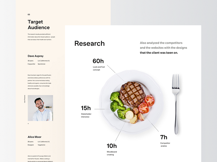
Research
We had a brainstorming and stakeholder interview session to help us analyze some of the feedback that was gotten from the clients team.
Target Audience
The research results provided sufficient information about the Vessel audience - people that care about their health and nutrition. It is someone who exercises regularly and focuses on a healthy diet. Users who are already tracking their data: steps, heart rate, sleep, etc. and want to improve or optimize their health.
User Flow
User flow will show you how the user navigates the application. We have highlighted the most important sections.
Wireframes
Wireframes - are the skeleton view of the app which allows us to focus on key functions, elements, and actions to improve the usability before starting to reskin the app.


