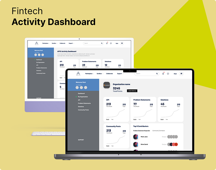
FinTech Dashboard - High Fidelity Wireframe Design
Case Study
Client Background:
Our client, a leading Fintech company, offers a suite of financial services, including investment management, trading, and financial planning. The client's existing dashboard, used by both retail and institutional clients, has shown signs of user dissatisfaction, leading to decreased engagement and potentially lost business opportunities.
Problem Statement:
The current Fintech dashboard suffers from multiple issues, including a cluttered user interface, complex navigation, and inefficient data presentation. As a result, users find it challenging to make informed decisions, leading to decreased user satisfaction and engagement.
The primary problems identified are as follows:
User Interface Complexity: The dashboard is cluttered with an excessive amount of data, charts, and options, leading to a steep learning curve for new users.
Inefficient Navigation: Users struggle to find the features and information they need due to a confusing menu structure.
Data Overload: Users are overwhelmed by an overload of financial data, making it difficult to focus on key metrics and insights.
Inadequate Mobile Experience: The dashboard lacks a responsive design, making it challenging for users to access their financial data on mobile devices.
Missed Personalization: The dashboard doesn't effectively cater to individual user preferences and needs, missing opportunities for tailored insights.
Research Summary
My research involved conducting surveys, interviews, and usability testing with a sample of the client's user base. Key findings from the research included:
82% of users found the existing dashboard confusing and overwhelming.
67% of users expressed dissatisfaction with the mobile experience.
56% of users desired more personalized content and recommendations.
70% of users believed that improved data visualization would enhance their decision-making.
Proposed Wireframes
UX Visual Design - Low-Fidelity wireframe screens


