Brand Identity Development for Stay Connected
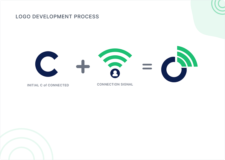
Logo Development Process
The logo development process for "Stay Connected" involved a client briefing, research, and conceptualization. Designers combined the initial "C" with a connection signal icon, focusing on unity and simplicity. The selected concept was meticulously crafted, with a color palette and user-friendly typography. Feedback and revisions ensured alignment with the client's vision, and extensive testing guaranteed scalability. The final design, now part of brand guidelines, has been successfully implemented across various platforms, embodying the mission of effortless and meaningful connections.
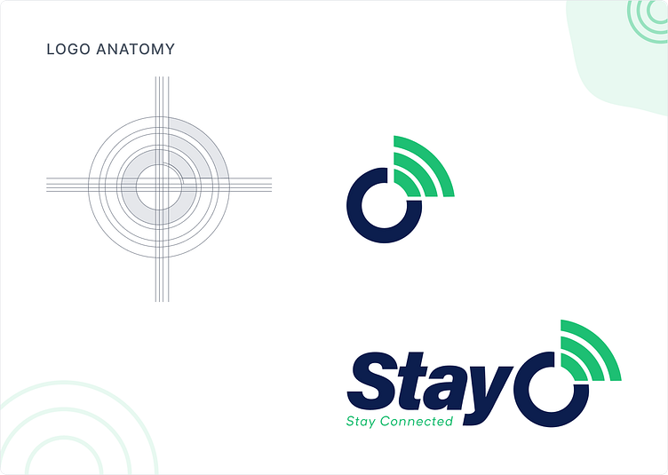
Logo Anatomy
The Stay Connected logo cleverly integrates the initial "C" from "Connected" with a connection signal icon, symbolizing effortless and enduring connections. The warm color palette, clear spacing, and modern typography make it welcoming and user-friendly, encapsulating the brand's mission in a visually memorable and cohesive emblem.
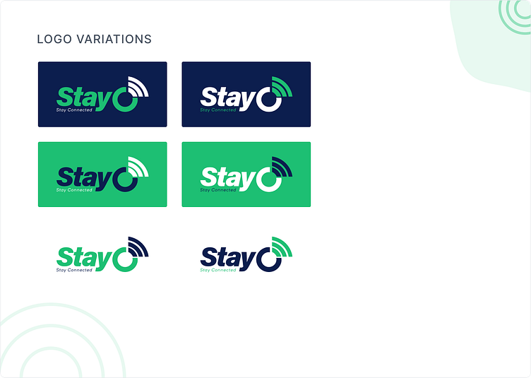
Logo Variations
There are different versions or adaptations of a Stay Connected logo. These variations maintain the core elements of the logo while adjusting them to fit specific contexts, applications, or platforms. Logo variations are crucial for ensuring that the logo remains effective and visually appealing in various situations.
Brand Identity Development for Stay Connected
Stay Connected, a flexible telecommunication company focusing on individual solutions for Business. It provides telecommunication services.
We'd love to know what are your thoughts on it! 💭
Don't forget to press ❤️(L) and don't forget to follow the Truemark Dribbble account.
--------------------------------
Wanna collaborate with us? Shoot your business inquiry to prabin@truemark.com.np
Find us on:
