Logo Design for education oriented lenitas gGmbH Karlsruhe

Freelance Logo Design for Lenitas
On their website Lenitas.de the privider/carrier for kindergartens, schools and other educational children / Teenager Services describes their philosophy as follows:
With the name “Lenitas” (lat. = “giving time, serenity”) we aim to clarify the focus of our work: Giving time and taking the world more calmly.
In today’s fast-paced world, and the stress it causes for everyone, we are particularly concerned to give children and parents enough time to grow together, to develop and to feel comfortable with us. We support them in creating more peace in moments of hectic everyday life. We also see this as a guiding principle in our pedagogical work.
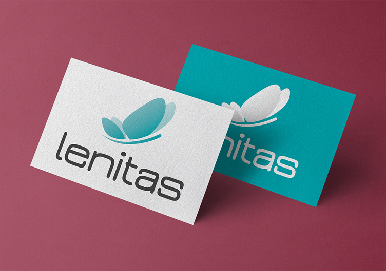
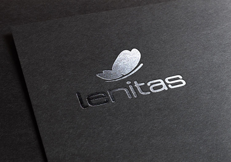
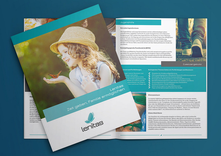
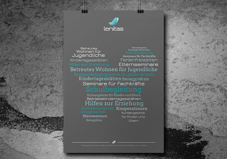
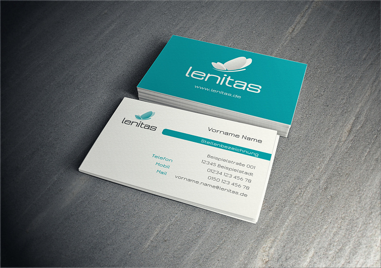
Logo
With the smoothness its wide typeface with rounded angles and lines implies and the soft, water resembling turquoise the logo aims to instill serenity and softness. The butterfly symbolizes growth, in a playful, positive manner.
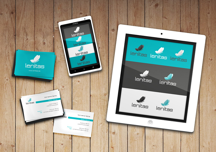
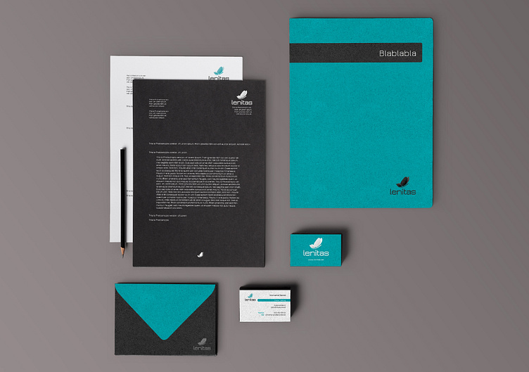
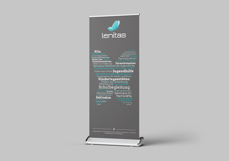
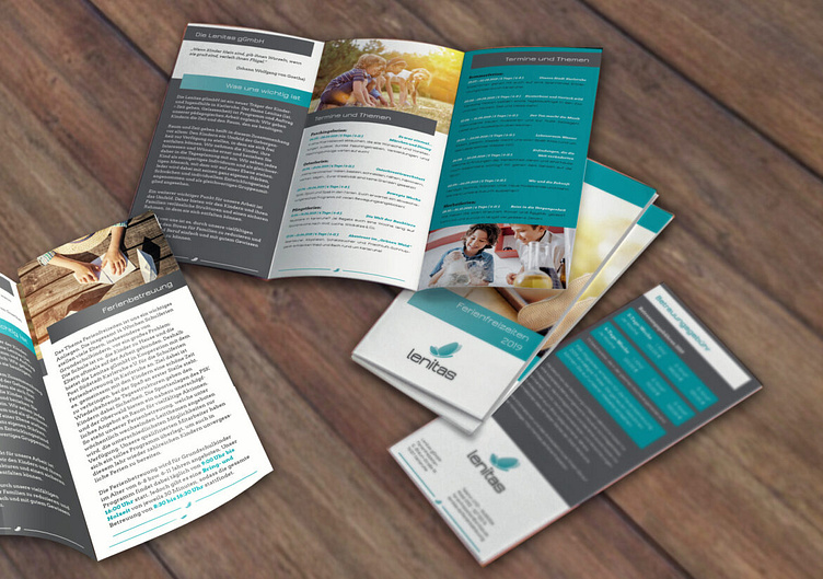
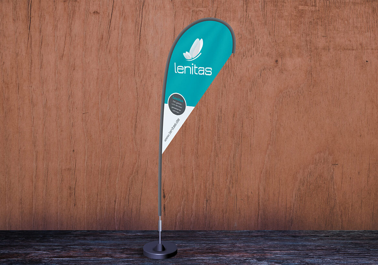
Other Jobs I did for lenitas
See and read about all jobs I did for lenitas on my website.
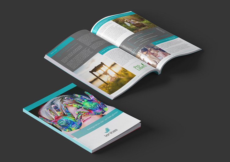
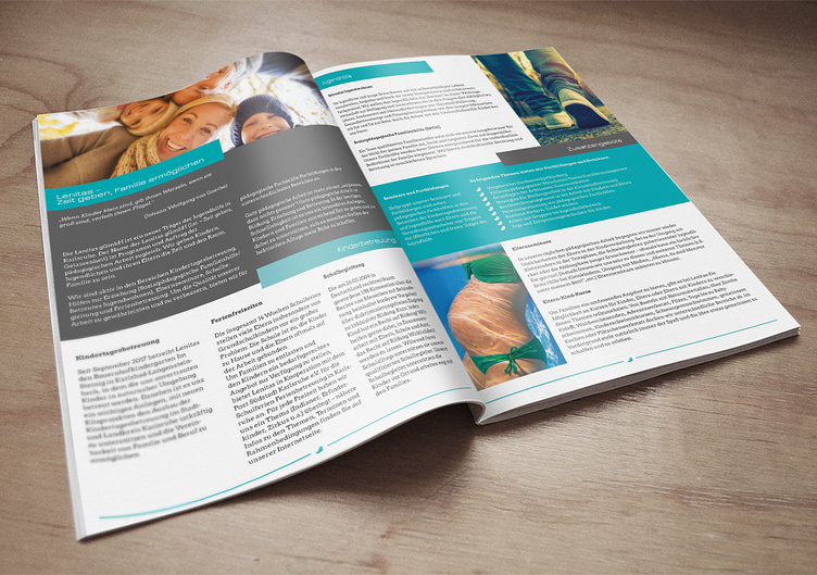
For more information and works please check https://alexandragregor.com.
Want your own Business Cards, logo or visual corporate identity personally created for you? Check out my work and customisable artworks on https://alexandragregor.com, say hi@alexandragregor.com and let's talk about how I can help you!