Meow Manor • Branding
Passion Project
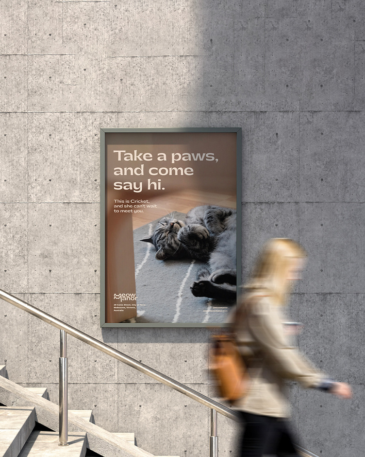
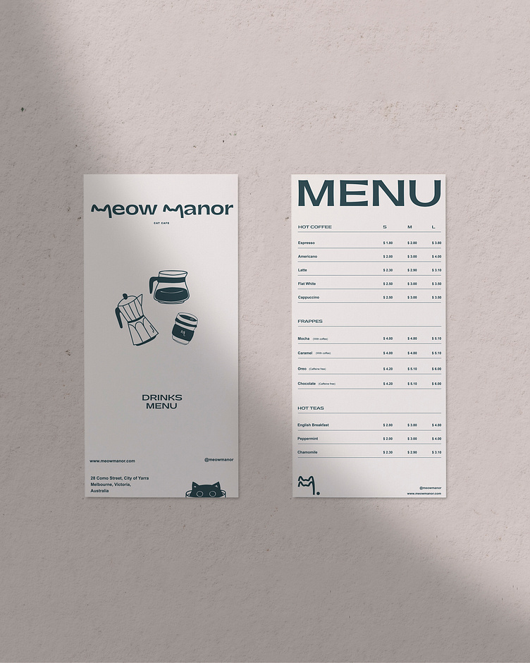
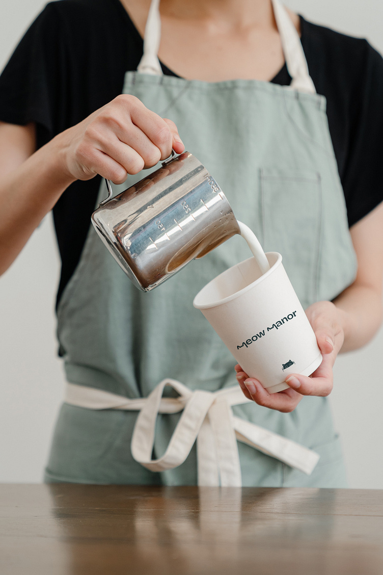
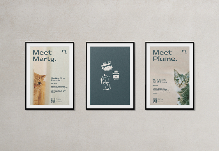
Located in the heart of South Yarra, Melbourne, Meow Manor seamlessly blends modern design with cozy comfort. Visitors can indulge in freshly brewed coffee and delicious treats while enjoying the company of the feline companions. The inviting atmosphere, filled with the soothing hum of contented cats and friendly conversations, provides a tranquil escape from city life.
It's a haven for cat-aholics and coffee enthusiasts, where moments of pure joy and connection await.
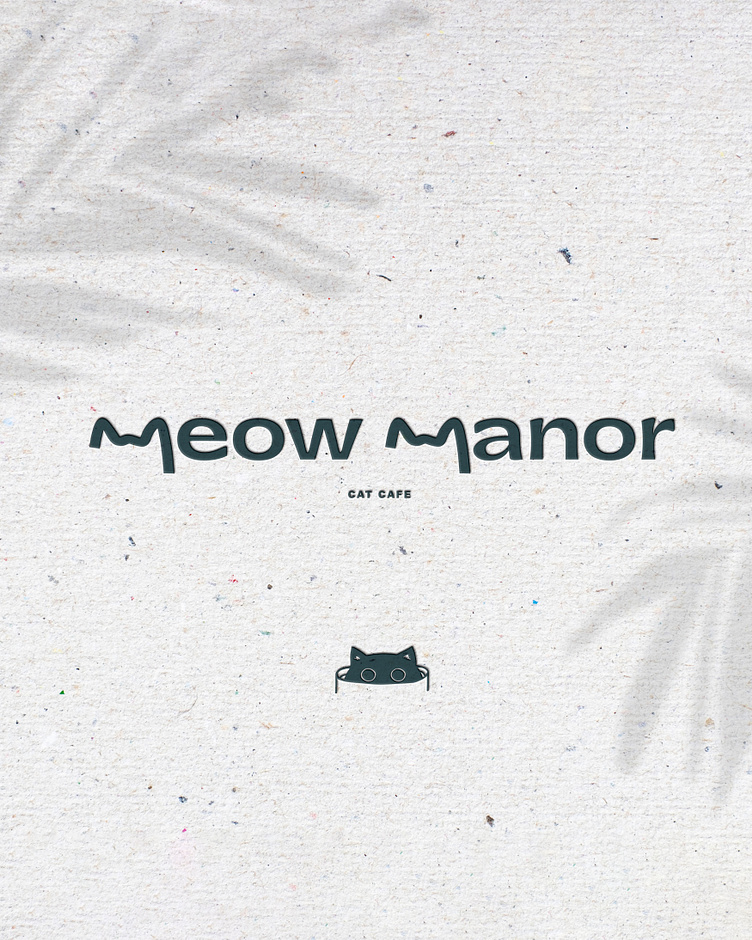
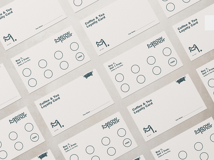
The Logo
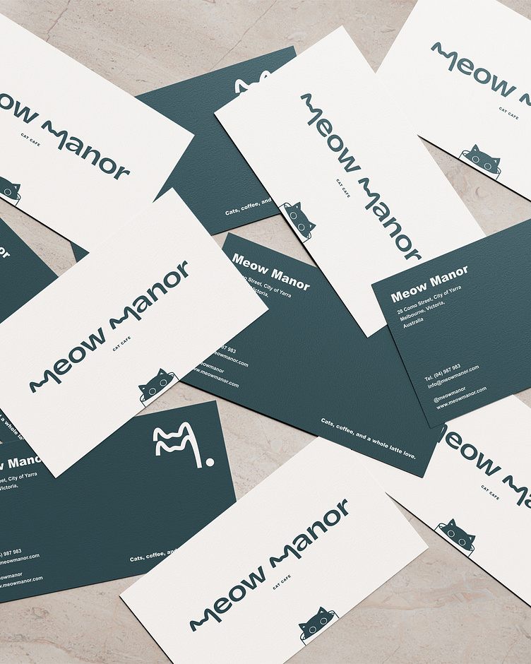
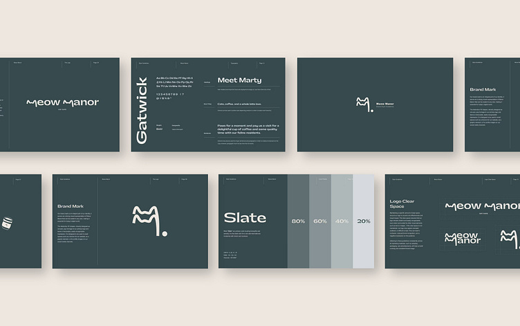
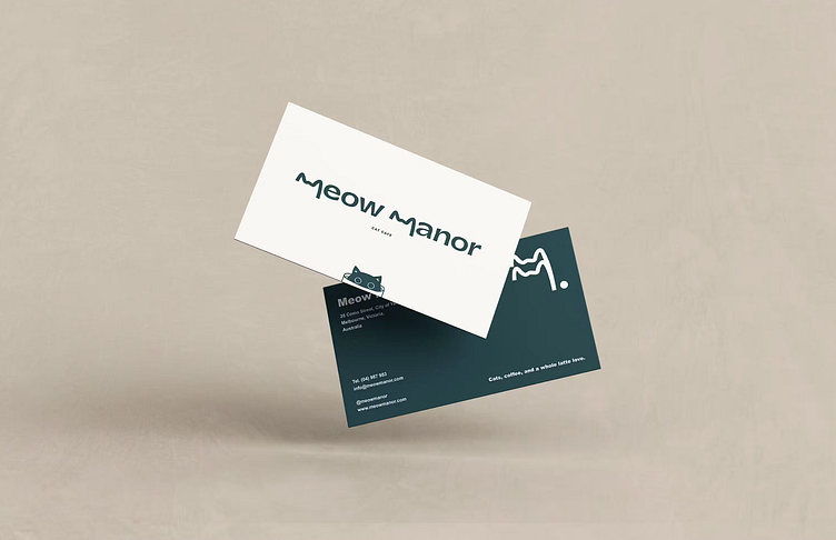
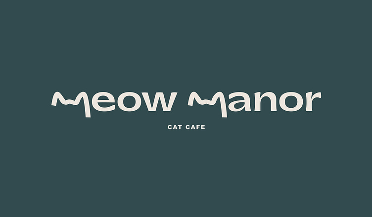
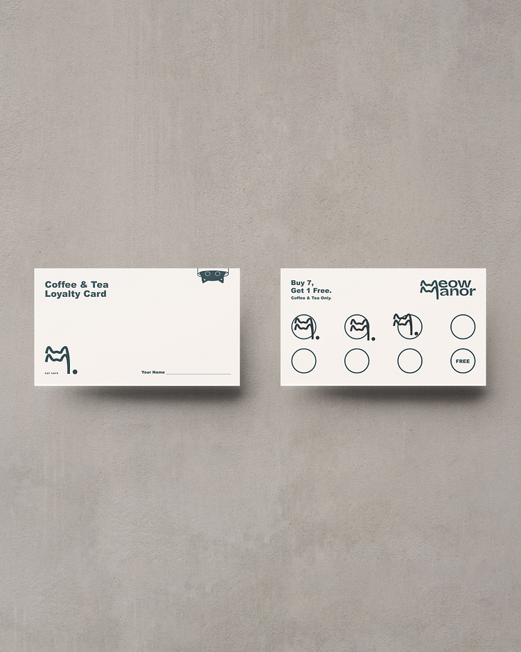
The logo was designed to exude a modern, clean, and unique aesthetic, all the while retaining a playful and welcoming feel. As a nod to the feline companions, we playfully shaped the "m's" into cat ears, creating the illusion of the top of a cat's head.

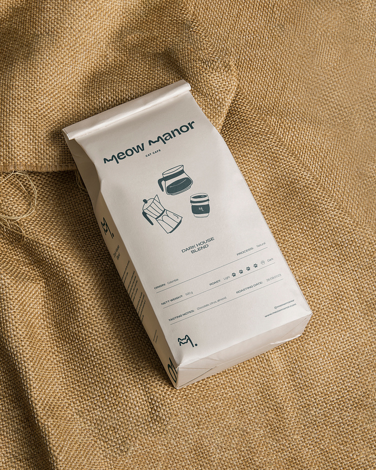
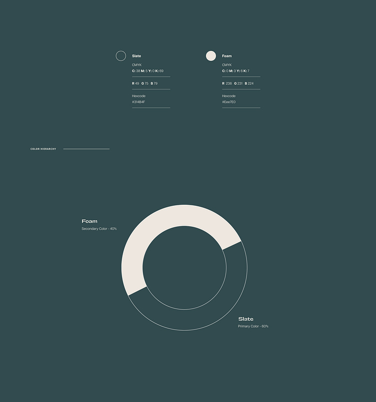
The Color Palette
We chose a minimalistic color palette to harmonize with the brand's modern, charming, and welcoming character. By limiting it to just two clean colors, our aim was to evoke a sense of peace and tranquility, avoiding any potential overwhelm or distraction that too many colors might bring. The final color choices consist of a deep, yet gentle gray-blue to evoke calm and serenity, paired with a soft beige shade to infuse simplicity, warmth, and a modern touch.
The Typography
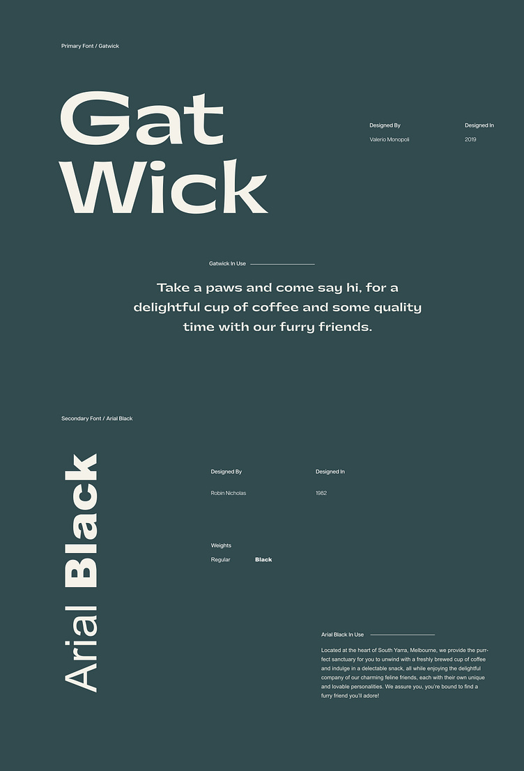
In choosing the typography, our aim was to establish a seamless connection between the colors and the type. We wanted something bold and modern, yet possessing a unique touch that resonates with the brand's personality. For the primary font, we went with a sans-serif typeface to emphasize the brand's modern feel. It's a distinctive type, giving the brand an elegant, modern vibe with a touch of playfulness. To complement it, we selected a basic font that doesn't overshadow the primary type and ensures easy readability for viewers engaging with the content.