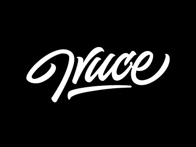
Truce
Currently working on a lettering for a local upcoming apparel brand named Truce. The client want something simple, unique and can be easily recognisable hence i go with the unconventional way of how letter T is being presented and the rest of the letters. However still working on the flow for the T and R as the flow on the UCE is smoothed. Would like to hear some inputs of yours. Thanks!
More by theregularjo View profile
Like
