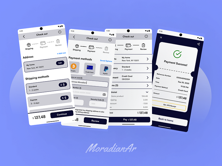
Checkout Page
my new work is a checkout process for an online shop.
and these are some tip to design a checkout pages with better user experience.👇👇
1. Pre-imported cards save on previous payments.
2. Make it easier to fill out the form.
3. Recognize and display the service provider (bank) of that card from the card number.
4. Formatting and validation should be done automatically
5. Clear error and confirmation messages.
6. If possible, provide installment payment conditions.
7. Try to provide a safe space on the payment page, so that the user does not leave and give up and reduce exit ways as much as possible.
8. Display the final payable amount clearly and interestingly (especially next to the payment button).
9. Use the right words (especially in buttons).
sources :
How to build a killer credit card checkout page that converts
7 important tips to remember when designing your credit card checkout process
How to optimize checkout pages: 10 UX design tips
I wrote a blog about checkout ux tips, in persian language and I'll be glad if that be usefull for you:
https://moradianar.ir/sign-up-page/
thanks for watching...

