Herddle
About Herddle
Combining people with end-to-end technology to make lettings & property management easy for renters & landlords.
Unfortunately due to an NDA images only permitted images the platform can be shown
The Task at Hand
To assess, test and audit the user experience and interface of the Herddle platform across both mobile and desktop
Re-design the customer experience according to the latest UX principles and industry standards with a focus on scalability
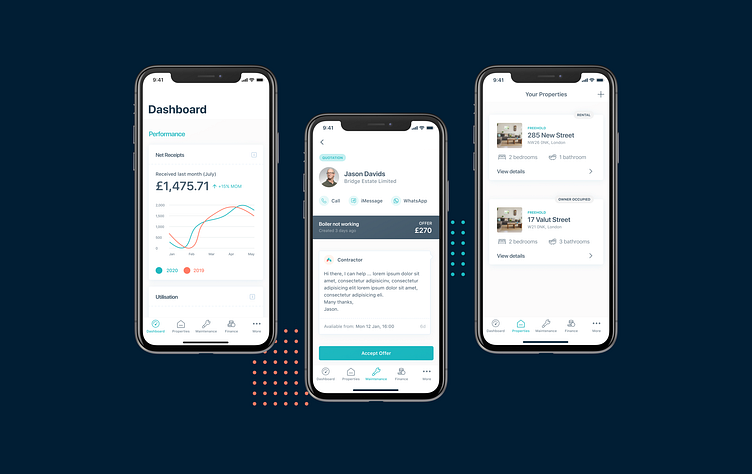
Create a bespoke mobile experience incorporating a ‘lite’ approach to key features
The Target Audience
Herddle’s aim of connecting landlords, tenants and agents creates a broad user base with very different needs.
Landlords
Required a simple and holistic way of managing their portfolio
Agents
Required a comprehensive suite of tools to manage and attract tenants. As well as manage property maintenance and regulation
Tenants
Required an efficient way to see their rent payments, make and track maintenance reports
A look under the hood
Key decision makers for the audit
High-rate of drop off from initial sign ups despite the apps advantages
Poor reviews across the iOS and Google Play store
These often highlighted poor overall experience
A dated UI with poor use of space and lack of information density
Completing the audit
I undertook a month’s long review of Herddle’s current design infrastructure from their Figma files, to their component management and underlying UI framework. This also included looking at the current user mapping and data collection around users progress through the platform. The data was found to be incomplete and largely useless.
Along with this I sat down with users representing each of the distinct user categories for interviews, feedback sessions and product walkthroughs
Interviews
Focused on extracting the core dislikes, feedback and frustrations of the products usability
Feedback sessions
A wider look both internally and externally on the issues covering both usability, the design process and development comms.
Walkthroughs
Guided walkthroughs of the product by each of the stakeholders to get into the nitty gritty detail of the issues
Summary of the core problems identified
The onboarding experience lacked clear calls to action
As well as a sense of a lack of progress due to it’s length (10+ steps) and missing step counter
Poor data representation with incompatible graph layouts and wasted space when no data was present
No clear calls to action for managing maintenance requests, with features hidden 2-3 levels deep in burger menus
Poor internal messaging UI and lack of notifications between tenants and agents, leading to long lead times to find easy resolutions
Inconsistent use of button styles, font sizes, iconography and viewport widths
No in-app or app based notifications
Lack of accessibility features and poor accessibility (e.g poor contrast, incomplete headers and no text to speech support)
Moving forward
Getting back on track
After assessing, collating and prioritising the feedback with the head of product. We created a roadmap setting out the essential and fundamental changes:
Moving the underlying CSS framework to Tailwind, leveraging it’s TailwindUI library to complete the redesign efficiently
Implementing new accessibility features using RadixUI and guided by the W3C accessibility guidelines. Aiming to increase the apps usability across it’s very broad stakeholder groups
Integrating tools such as Storybooks for better component management on the front-end and to reduce duplication
Integrating Hotjar to collect better data around user movements and to find UX bottlenecks quicker
Re-designing the entire user journey based on the feedback to be more bespoke to each stakeholder group.

