Allbricks
About Allbricks
Allbricks is a new and very different way to buy a home. Instead of taking out a mortgage, our home buyers co-invest with qualified property investors.
With Allbricks, home buyers can get on the property ladder faster and based on what they can comfortably afford to rent.*
The Task at Hand
Complete a comprehensive user review and interview process, complete with focus groups
Design the underlying framework and user journeys
Design a scalable and fully responsive platform
The User Review
When bringing an alternative to the property market, a third way in the established mortgage and rent arena. A comprehensive UX review process was required to:
Learn, understand and find UX champions we could leverage for continual insight
Collect our first batch of data to inform our first steps
Understand the pain points of both traditional methods and identify common trends
No bland personas here - focused on finding real people and every day people to share their needs, wants and what they’d expect to see. This is behaviour based UX, not characteristic based UX....
Stakeholders
Allbricks had two key stakeholder groups, who could not have been more different. This required a split approach to gathering feedback as each group would have a very different design approach.
Investors
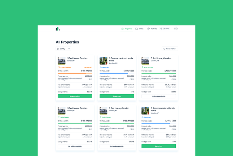
Investing into properties on the platform, so the focus was to put properties and data front and centre
Home buyers
Looking for alternative and often young (25-40), we prioritised a simple checklist to keep them up to date. As the process takes 3-6 months at least.
It’s a user journey, not a snapshot
We conducted continual focus groups and 1-on-1 sessions through the 4 year long process Allbricks was built.
We continually iterated based on feedback
Started building a base of UX champions within the organisation
Designing the process
Using a combination of FigJam and Miro I completed over 50+ flows, maps and data sheets to ensure we always had up to date flows and journeys.
The team and I used these to form the baseline knowledge between design, development and product management.
This meant we were always on the same singing from the same hymn sheet
Designing Allbricks
Designed from the ground up to serve both stakeholder groups in the manner which best suited them. Based on the research and testing conducted at the earlier stages (and towards the end for final validation)
Investors
A focus on Data (Yield, growth etc…)
Holistic insights into portfolio value, growth and the next best opportunity via their dashboards
Clear and concise buying and selling data
Home buyers
Focused on providing a step by step overview of the process
Easy access to the required information (e.g tenancy checks)
A focus on making it easy to get help via the support guides or calling their Champion
Clear financial information upfront for a transparent look at the required deposit and fees


