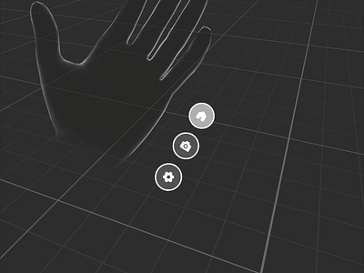
Fingertip Based Menu
When I shared my last interaction concept for a spatial hand-based menu, some people asked why I didn't put the menu on the fingertips since it would provide haptic feedback and, therefore, it would increase the accuracy and the interaction speed.
I did a few prototypes with this type of interaction in the past, and, indeed, it worked very well. But, as with everything in Design, the answer to the "Is it good?" question is "It depends™™™".
Several things are worth considering when you design spatial interactions like this for your product.
1) Interference with system actions. Since these gestures are extremely easy to perform, it's more likely that OS holders will reserve them for system calls. Meta OS already uses the index pinch-pressed gesture (when you look at your palm) to show the system menu. Other pinches they might reserve for custom quick actions to allow users to assign their own (calling a recorder or writing a message to a friend, etc.).
2) Finite number of fingers. It means that you can't scale the menu. If you need to add more items, you won't be able to do that.
3) Controllers support. If your app supports controllers, you must create a separate navigation to support them. It will confuse users since you can switch from controllers to hands and vice versa in runtime. Again, it might work for simple cases. Still, generally speaking, it brings a lot of challenging restrictions to your design process because you will need to maintain two navigation modes simultaneously. It may cause a situation when you have two distinguished interaction paradigms in one app. It will make the learning curve for your app steeper.
4) Avatars. Some products might have avatars. If your users can use avatars like a mutant ninja turtle with three fingers, an avatar with big hands, or without hands at all, you will need to support all the modes for navigation. And if your users can switch the avatars in runtime, constantly changing between different navigation patterns might challenge the app's usability.
5) Accessibility. In my previous concept, I used heavy settings for the lazy follower function that smoothed hand tremors. It significantly simplified the UI aiming task. You can't do this with this fingertip-based approach because the menu items are anchored to the fingers, and you must maintain their spatial proximity to map the visual signifiers (icons) with the actions (pinches). For people with hand tremors (or in a poor lighting environment that makes hand-tracking inaccurate), rigidly attached to fingertip buttons may look uncomfortable. However, this smoothing might work with only one button since, perceptually, you attach it to the whole hand.
So, it's a very powerful pattern but use it wisely :)
Stay tuned:
Dribbble — https://dribbble.com/Volorf
GitHub — https://github.com/Volorf
Twitter — https://twitter.com/Volorf
Instagram — https://www.instagram.com/olegdesignfrolov/
