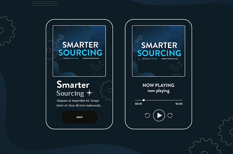
Podcast cover design

In brief the client wanted to see a cover with dark backgrounds/textures and light text to contrast. And also align with the direction of his website build.
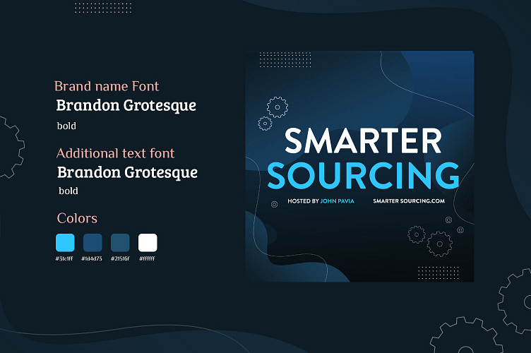
Brand shades and colors. For the podcast cover, I used colder colors and gradients, because these are the main colors of the website and the company's brief. Dark colors and minimalism have a good effect on the age categories of podcast listeners and subject matter. Dark colors and minimalism give more seriousness and solidity