Marbari (Icecream)
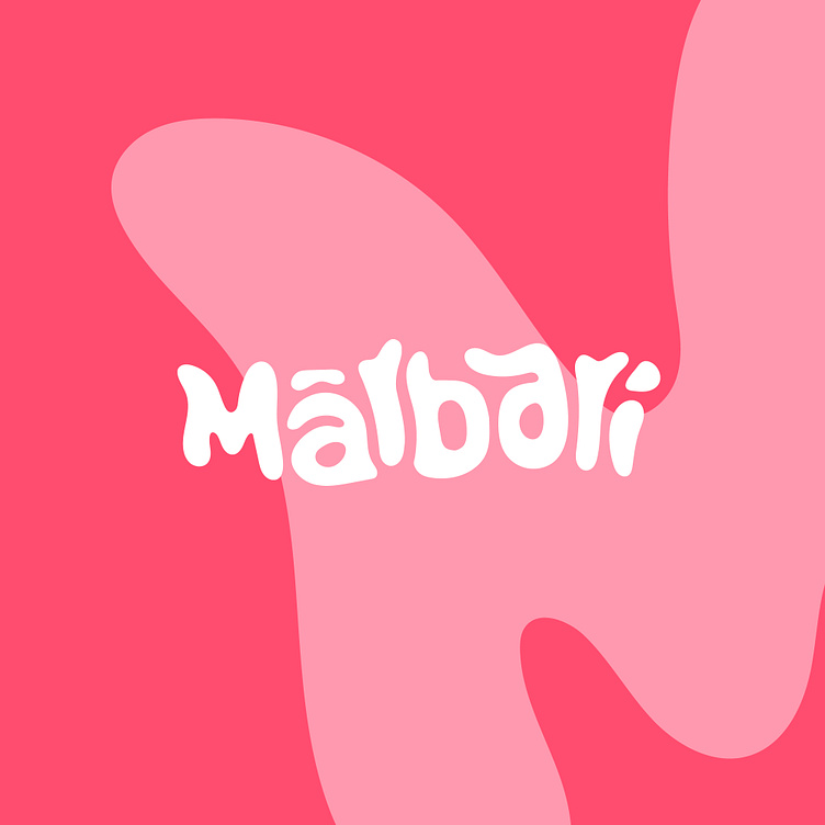
The logo design of Marbari, a charming ice cream parlour, has been carefully created to capture the essence and creaminess of their delicious ice creams. The logo features a unique typographic structure that melts, simulating the softness and velvety texture of freshly made ice cream.
The typography selected was meticulously designed to reflect the feeling of melting and fluidity. The letters seem to be in the process of dissolving, evoking the idea of ice cream melting in your mouth. This typographic choice not only visually conveys the sensory experience of enjoying creamy ice cream, but also creates a distinctive and memorable visual impact.
The logo isotype is equally ingenious. Using the letter "M" as symbology, a graphic element has been created that stands out and is detached from the logo itself. This distinctive isotype reinforces Marbari's identity, providing an instantly recognizable visual representation.
Altogether, Marbari's logo design effectively encapsulates the essence of the ice cream shop. The combination of melting typography and distinctive isotype creates a visually appealing and playful image that captures the essence of the ice cream experience. This logo will not only be recognized and remembered, but will also convey the quality and delicious offering of Marbari ice cream.


