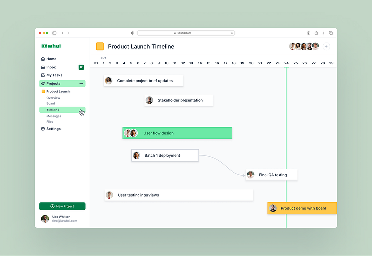
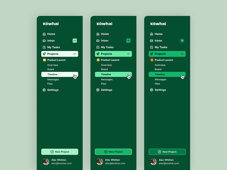
Side navigation bar with contrast options
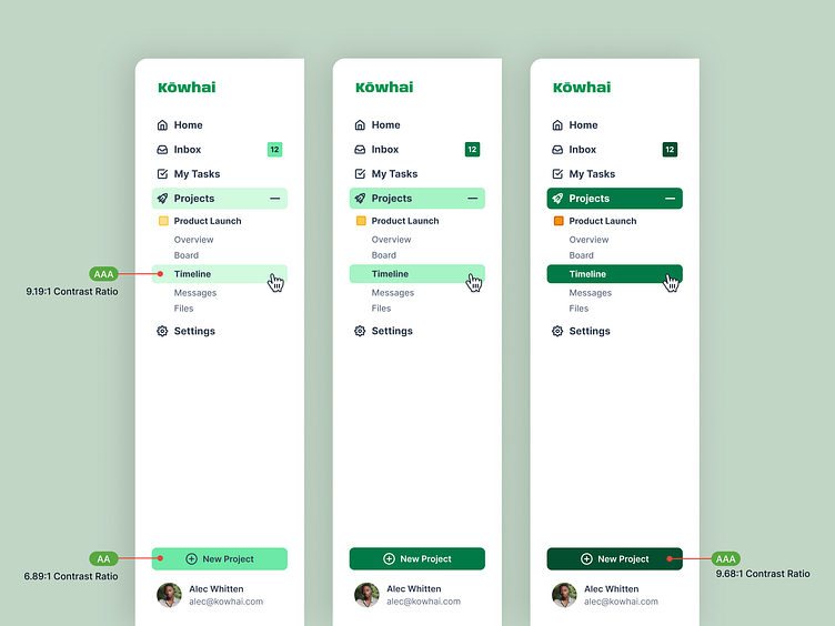
An accessibility feature to support low-vision and color-sensitive users.
Key components of the UI, such as buttons, notifications and hover states, are available with multiple contrast themes which users can switch between to optimize readability.
This can also be useful across devices, where one theme may work better in natural lighting (mobile devices) and another in a low lit room.
Contrast themes are also available in dark mode, and all color combinations are WCAG AA+ graded.
〰️
Made in Figma