Quindanning
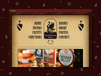
This hotel is one of the most easily recognizable historic buildings in its district. It has a retro look and a lot of jarrah panelling. This design version was dismissed however and the final version had a much cleaner approach. I like this version better though because of its Old Tavern feel and worn out graphics. Vintage typography and graphics, jarrah wood background, and retro interface are the elements that bind this layout together
More by Razvan Garofeanu View profile
Like

