HACHI NAILS | LOGO DESIGN & BRAND IDENTITY

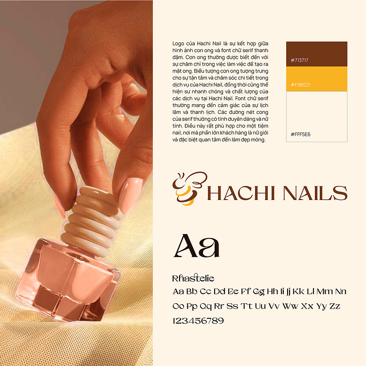
Design logo for nail spa, the Hachi Nails logo is a combination of bee image and bold serif font. Bees are generally known for their hard work to make honey. The bee symbol symbolizes the dedication and detailed care in Hachi Nails's services, and also represents the promptness and quality of Hachi Nails's services. Serif fonts often give a sense of elegance and elegance. The curved lines of serifs are usually graceful and feminine. This is very suitable for a nail salon, where the majority of customers are women and are especially interested in nail beauty.
Logo and Branding Project. Logo is designed for a nail spa.
Copyright © Bee Art. All Right Reserved
Contact us:
• Hotline/ Zalo: (+84) 77 34567 18
• Email: info@beeart.vn
• Website: www.beeart.vn
• Facebook: https://www.facebook.com/BeeArt.vn