HOXA LOGO

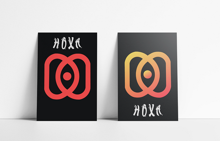
This is a Hoxa brand logo project used for creative business. I used Illustrator to draw the logo and Photoshop to create the background, blending the two designs together.
The main dominant letter of the logo here is the letter H with the combination of both letters D and a dot in the middle. This creates an eye right in the middle of the logo.
The main color is the image on the right using a yellow gradient combined with red to create a hot orange color in the middle area.
Meaning: Creates creativity for the middle eye, harmonizing the color balance between the two sides. Modern and sophisticated, suitable for an Agency.
Đây là dự án logo thương hiệu Hoxa dùng cho kinh doanh sáng tạo. Tôi đã dùng Illustrator để vẽ logo và sử dụng Photoshop để tạo background, phối 2 design lại với nhau.
Chữ cái chủ đạo chính của logo ở đây là chữ H với sự kết hợp của cả 2 chữ D và 1 dấu chấm ở giữa. Điều này tạo ra một con mắt ở ngay giữa logo.
Màu sắc chính là hình phía bên phải sử dụng gradient màu vàng kết hợp với màu đỏ tạo nên màu cam nóng ở khu vực giữa.
Ý nghĩa: Tạo nên sự sáng tạo đối với con mắt ở giữa, làm hài hòa cân sắc giữa 2 bên.
Hiện đại, tinh tế thích hợp cho Agency.