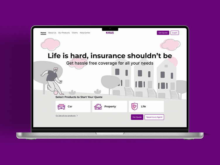
Insurance Co. Landing Page
Clarity, Frictionless, Value, Empathy, On demand, Reassurance, Custom tailored, Needs based, Fast, Simplicity, Guidance
These are keywords that encapsulate what customers want and expect from their insurance provider. The landing page is the first impression prospective customers have of the business. As such, I designed the homepage for *KAUS Insurance in such a way that:
It expresses the company's mission - The slogan "Life is hard, insurance shouldn't be" immediately signals that we want to make insurance easy for you. We are here for you.
It's simple, clear and easy to understand - It's as easy as possible to get a quote for common insurance policies. Home, renter's and automobile insurance are featured at the top and bottom of the page.
The value to the customer is communicated - Reviews by customers and financial websites bolster the company's reputation as reliable, transparent and trustworthy. The homepage highlights stand-out features, that is 24/7 customer service, flexible coverage and easy-to-file claims.
The design centers the user - The user chooses how to apply, online by themselves or by speaking to an agent over the phone. They can apply right away or browse the company's offerings then apply.
Users questions are answered - Sometimes, users won't be able to find what they're looking for. In that case, frequently asked questions as well as links to the help center and a contact form are there to help guide them.
*KAUS is a not a real company. This is a conceptual student project I completed at DesignLab UX Academy.
KZUX Design
Hi! I'm Kathy Zhang. I am currently a student at DesignLab UX Academy where I am deepening my knowledge in all things user experience.
Let's connect!
kathy@kzux.design
Visit my website at kzux.design

