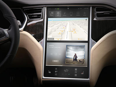
Tesla Dashboard Screen Concept
I've never felt like every piece of the UI on the Tesla screen had an overall cohesive look and feel, so I thought I'd play around with it.
I might be putting together some motion pieces for how I feel some the UI should work. Missing elements, like volume, aren't there for a reason.
UPDATED: see volume shot here
More by Parker Ehret View profile
Like

