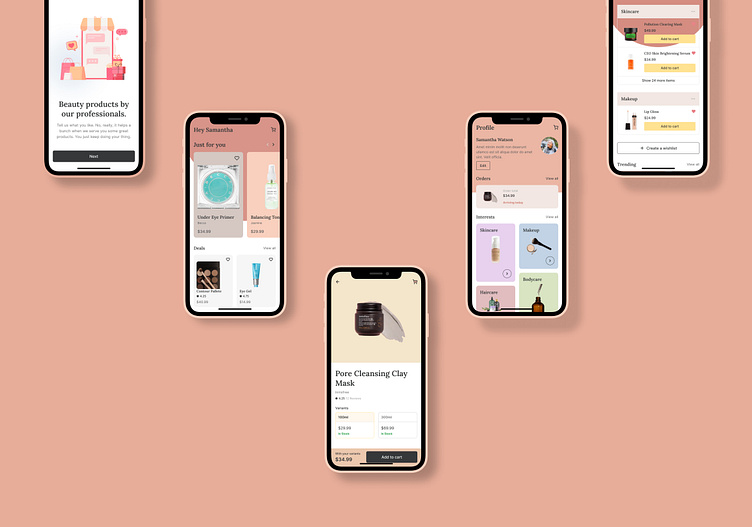
BEEHIVE- A Beauty and Skincare App
Hey Everyone, This is my first ever design after taking a course on Udemy. (Link to the course : https://www.udemy.com/course/the-complete-app-design-course-ux-and-ui-design/)
This design is a based on an idea of an app for shop beauty and skincare products online easily and quickly.
Intro Screen
When a user opens the app for the first time, they land on this intro screen.
Onboarding Screen
Here is the onboarding screen where users are going to land after the Introduction page.
Home
The home screen where users can browse products and add their favorite products to cart to buy them.
Product page, Checkout Page, Order Confirmation Page
Once user clicks a product, they land on the product page, where they can select the variant of the product and read reviews and then add it to the cart to buy it.
After adding the product to cart, when the user reaches the checkout page, they can place their order by paying the amount.
Lastly they receive an order confirmation through a GIF on Order Confirmation page.
Profile
The profile page where a user can edit their profile and manage their orders and interests.
Wishlist
Here is the Wishlist page, where the user can find all the products they have liked and manage them.
Prototype
Here is the prototype of all the screens. The prototype is divided into different flows so it'd be easy to understand every action. Kindly check it out.
You can also view and navigate these prototypes yourself here: https://www.figma.com/proto/twXOAkNdxdnNbEy5TlLkeJ/Beehive?page-id=30%3A6353&type=design&node-id=30-6380&viewport=239%2C59%2C0.08&t=MKYcKB2nyz5520zU-1&scaling=scale-down&starting-point-node-id=30%3A6354&show-proto-sidebar=1&mode=design
Thank you for viewing my work. Kindly leave your valuable feedback through the comments.
If you liked my work, show it by liking this post.


