Graphic Logo Design Sollbruch Beratungsbüro

What the client asked for – a Graphic Logo Design
Client Sollbruch Beratungsbüro asked for:
• A somewhat open cube
• M.C. Escher-esque as in being possible to looked at from different perspectives, switching between them while looking at it
• Since the client combines a variety of work areas in their business, the logo was less to signify “learning” as a focus element, as implied by the former name Lernstudio, but stand for the studio and its office spaces themselves
• Sketched or sketchy elements are very welcome
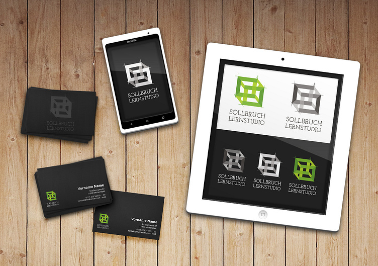
The Result
The final cube can be seen from above or below. Sides are open, and the openings build an S, as the initial of the Sollbruch Beratungsbüro (Consulting). In order to highlight the S, the endings of the S are rounded. The edges extend into pencil lines implying a previous sketch.
The main color is a fresh green, for copies and black and white prints as well as for diverse backgrounds, there are a black, a negative and a green version with inverse, white type and without type, the logo is still recognisable when scaled down.
Even though the client has renamed and changed parts of their business and works in the meantime, focusing on the Sollbruch S instead of the main branch of work back then ensured a further usability and is still in use by the client today.
Web: sollbruch.biz


