Redesign UI Inspiration
1. Introduction:
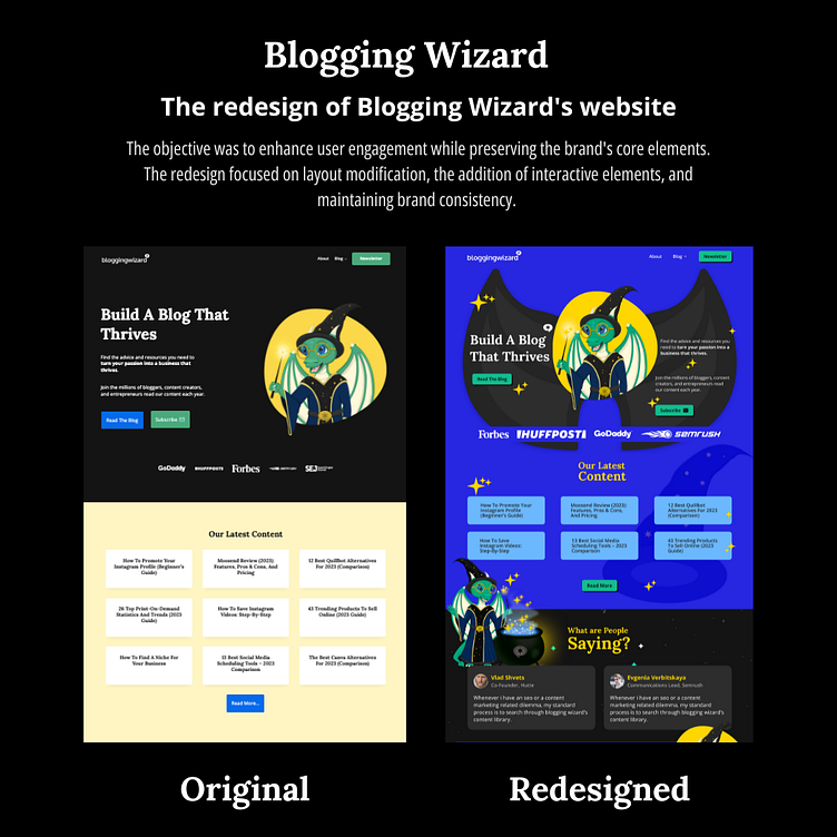
The redesign of Blogging Wizard's website aimed to revamp the user interface, making it more engaging and visually appealing. The redesign process focused on preserving the website's brand identity while incorporating new interactive elements like cursor magic effects and thematic visuals.
2. Redesign Objectives:
Enhance User Engagement: Increase user engagement through visually stimulating elements and interactive effects.
Preserve Brand Identity: Retain the website's font family, dragon wizard logo, and overall brand identity while introducing new design elements.
Create Focal Points: Establish clear focal points on the website to guide user attention and enhance user experience.
3. Design Choices and Implementation:
Cursor Magic Effect:
Implemented a cursor magic effect to evoke a sense of magic and enchantment associated with the brand's name, 'Wizard.'
Designed the effect to follow the user's cursor, enhancing the interactive experience and creating a playful atmosphere.
Visual Elements:
Incorporated stars in the design to symbolize magic and add a touch of glittery appeal, creating an enchanting ambiance.
Positioned the dragon wizard logo at the center of the layout, serving as a focal point to attract user attention and reinforce brand identity.
4. User Experience Implications:
Enhanced Engagement:
The cursor magic effect successfully captured users' attention and encouraged exploration, enhancing overall engagement.
The incorporation of thematic visuals such as stars and the dragon wizard logo created an immersive experience, aligning with the brand's magical theme.
Brand Consistency:
Retaining the website's font family and core brand elements ensured consistency, maintaining a seamless transition for existing users while attracting new ones.
Focal Point Effectiveness:
Placing the dragon wizard logo at the center of the layout effectively established a focal point, guiding users' attention and creating a memorable visual impact.
5. Conclusion:
The redesign of Blogging Wizard's website UI successfully achieved its objectives of enhancing user engagement, preserving brand identity, and creating clear focal points. The incorporation of interactive cursor effects and thematic visuals contributed to a magical and enchanting user experience. The redesign not only revitalized the website's visual appeal but also reinforced its brand identity, creating a delightful and captivating environment for users.
Keywords: User Experience, Website Redesign, Interactive Design, Brand Identity, Cursor Magic Effect, Visual Appeal, Focal Points, Engagement.
let's connect
View on figma :- https://www.figma.com/file/TWHvTWwTTHzqsz4jfvXi1U/layout-design?type=design&node-id=934%3A2&mode=design&t=JBTDBkdaXLKZPEH8-1
3. Design Choices and Implementation:
Cursor Magic Effect:
Implemented a cursor magic effect to evoke a sense of magic and enchantment associated with the brand's name, 'Wizard.'
Designed the effect to follow the user's cursor, enhancing the interactive experience and creating a playful atmosphere.
Visual Elements:
Incorporated stars in the design to symbolize magic and add a touch of glittery appeal, creating an enchanting ambiance.
Positioned the dragon wizard logo at the center of the layout, serving as a focal point to attract user attention and reinforce brand identity.

