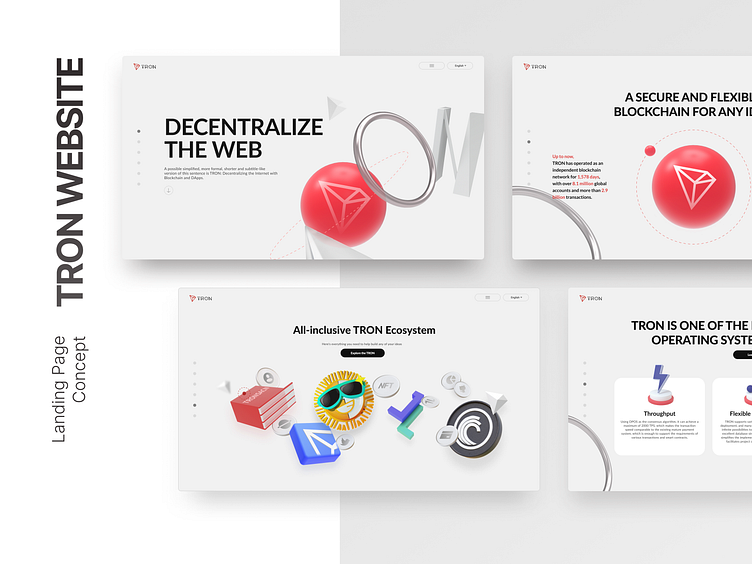
TRON Website redesign
The redesign of the TRON official website, the internal proposal, and then for some reasons, unfortunately did not go live, the core elements of the site lies in the TRON 4 letters of the distortion, respectively, to symbolize: build, globalization, ecological closed loop and value. Hope you like it!
Have a project in mind?
Connect me : someoneales2021@gmail.com and let's make it happen! : )
More by someoneales View profile
Like

