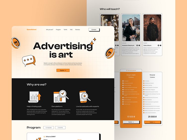
Space School | Landing page redesign
Hi there, everyone!
Get ready for the fresh look of our dribble shot landing page "SpaceSChool"redesign. We've switched to bright colors with a pop of vibrant orange, and now we're using vector illustrations to showcase the artistry and precision of our experts.
Press "L" for Like❤️
What do you think about this design? Let me know your thoughts in comments 💬
📨 Have a project idea? Please contact me:
More by Ihlas Ishankulyiev View profile
Like


