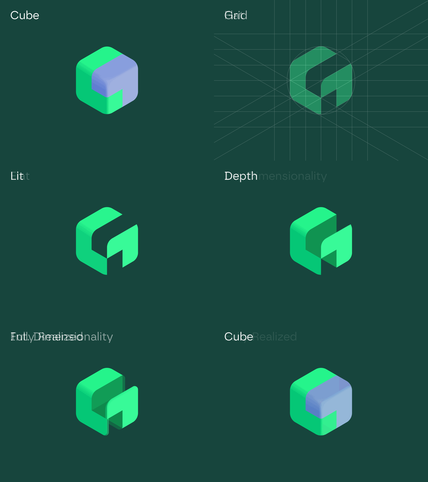
Depth Explorations on Logomark
Exploring a range of potential options for how much to push dimensionality & depth on this abstract G mark. Generally lean towards a flatter aesthetic but it's fun to push into unfamiliar territory.
More by Sean Brice View profile
Like


