Neuro Health
Neuro Health's approach to healthcare is grounded on the premise of functional and integrative care from a neurological perspective. When this approach is coupled with specific therapies it produces optimal results shown to improve a patient’s quality of life long-term.
For a visual identity, we wanted to create something that was simple and recognizable, yet modern and relaxing. The primary visual identity was tackled in 3 parts; logo/icon, color, and typography. The logo has a couple of different variations, but the core structure is meant to be relatively straightforward. This is a new company in a relatively small market, and so readability was key.
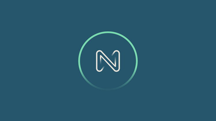
The icon was built as a combination of the infinity symbol representing both restoration and longevity, a skeletal style to visually lend itself to the chiropractic space, and an "N" for obvious reasons. The color was chosen to be both calming as well as have a little punch when needed. In the brief, it was expressed that the core clientele would be individuals on the autism spectrum, and so a more soothing color palette was warranted. And then the typography was chosen to be both legible and modern; taking some stylistic risks with the standard heading style, and offering some straightforward legibility with the body copy.


